Saturday, April 10, 2021

Go to H*LL! All of you!


A blast from 1969, the year of "The Summer of Love."*

It's the fantasy of everyone who's ever been an Art Director, Creative Director, Copywriter... to leave leave their crappy job, crappy clients and crappy, deflated ego in a glorious (but suitably pithy) buuuurrrrnnnn.

You know - the kind of buuuurrrrnnnn leaving an open can of sardines tucked behind your dorm-room dresser for the next shmuck to find...

It's cruel, dysfunctional and wrong.  Thankfully few people actually make-good on their fantastic "F-YOU!" and simply quit their jobs to go onto other, hopefully more productive, careers.

But a few...

"Honey, I CAN'T TAKE IT ANY MORE!!  I hate the Ad Business, I hate Ford Motor Company, I hate dealing with talent agencies and I hate working with Photographers!  I'm coming home unemployed!"

"That's ok darling.  We have enough food to last the week...have you written a resignation letter?"

"HA! JUST WATCH!"

And behold - the cover of the 1969 Ford Falcon sales brochure, complete with demon-child, hearse (with ironic "Sports Coupe" script) and last-rites bouquet (before the human sacrifices begin, shortly after sun-down).

Well played, angry creative-type.  Well played indeed.

More here


*And, according to a few angry old people, the year that consummated the decline of civilization.

Friday, February 26, 2021

Hitler makes bath time fun!


So it's been.  What.   Seven years since this blog was last updated?

At one time it was famous.  Really famous.  Like, you and I bumped into each other in the grocery store all day long and it was glorious.  "Who ARE you?!?"

"I'm... that guy."

And you laughed... and we laughed... and it was glorious.

But that was then, this is now.  I checked-out because I got all sanguine about life.  That ended today.  And I blame "Celebrities" Kristen Bell and Dax Sheppard.  Of course you know them for their terrific advancements in humanity but they also market a product called "Hello Bello". 

Their products get children NATURALLY clean (as opposed to UN-naturally clean).  

I'm a total capitalist.  Look at what Socialism and Communism have done for humanity... (keep looking, I'll wait).

No, I won't.  I don't have that much time.

But there's a burden to capitalism.  It's called... being...  (I want to write, "A good human" but I won't because I'm not a good human.  I'm a Christian.  And that makes me totally dependent upon Jesus for anything good that I have.).

...

Reasonable human?  Yes.  Let's settle on Reasonable.

Anyway.

A.  Kids have been getting "naturally clean" forEVER.  There is NOTHING "un natural" in the universe.  Ever.  Ever, ever, ever and EVER.   Granted, we can clean children with concoctions like turpentine, titanium brushes and Brillo™ pads to horrible effect but they're still NATURAL.   Everything is natural.  Thanks to the big-bang.   What the Hello Bello folk are trying to say is, "Now, you can clean your children with good things versus the caustic waste our parents used to ruin US."

Bzzzt.


B.  Notice that Kristen Bell's BUTT and Coccyx area has a perfectly 90-degree flat area?  (sigh).  Why do people buy Photoshop and suddenly get lazy?  I don't know.  I buy Photoshop and suddenly I feel like I have to work five times as hard to pay the yearly fee... but that's just me.  Or, maybe she really does have a perfectly plan-form butt-coccyx area.  If so, Dax has a place to build model airplanes on.

C. What about the "O!" face!  Tell you what, everything seems fun with the O face.  Until... well, mom and dad decide to inject you with growth hormones and you grow a head of hair that would make Harry Stiles proud!

This is Harry Stiles.  I don't know if he is attractive or not.
But he has a HUGE head of hair.   And he parts it like the Bello Smello (whatever ) kid.
Coincidence??


D.  YOUR KID LOOKS LIKE HITLER.  Geez.

How many kids in diapers a.) play in the tub with (natural) chemicals?!  b.) have a Stiles-esque mop of hair?!  c.) have parents that are SO FREAKING CLUELESS INTO HISTORY that they give their children the hairdo of the 20th Century's worst....

Wait.  

Wait.

Are Kristin and Dax sending us a message???

I think I may have decoded the message with my ballpoint pen.  And I didn't even need Photoshop!

"Hello Bello"??

More like...

"Hello Fourth Reich!"  But that doesn't fit on the bottle.  And it doesn't really... "roll off the tongue" y'know?  Hmmm. 

"Hello Hitler?"

Sure.  Why not.  The past is the past.  Let's move on! 

I hope Kristen can find someone who can make awesome uniforms to match her perfectly flat butt-coccyx area.


Sunday, October 05, 2014

And here's why daddy drinks: Caleb.


Caleb.

Silly Caleb.  Wily Caleb.  Clever Caleb.  Computer-owning Caleb.

Trust-fund Caleb.

"I'll design your logo for $5" Caleb!

Right now, there are graphic artists, designers, IP attorneys, advertising agencies, political consultants... looking at Caleb thinking the same thing:  I hate this guy.

Go ahead and look.  No, glare at Caleb's smirk.  Can't you hear the self-satisfied mumbling?

"I'm going to make it green!  Green!  he he he.  They're going to get a GREEN logo!  And I'm going to use Trebuchet!   (click click click click)  THERE.  A logo.  They are getting a green logo in Trebuchet!  (sips $9 latte).  With a purple penguin.  Like (click click) that."

"He he."

(Caleb clicks 'SEND', takes another sip of his $9 latte and flicks a text to his parents reminding them that his rent is due.  And he has decided to only buy groceries from a Himalayan goji berry prophet in Amsterdam).

In the meantime, a hymn from the book of Huey seems appropriate:


We gotta kick Caleb's ass.

Sunday, November 18, 2012

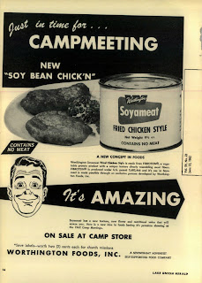
Vegan clipart. Amazing!


The ad above is for Soyameat - an unfortunately named "product" from 1962.

Go ahead and enlarge the ad - spend a few moments in wonder, disgust or oblivion...

Before we get to the ad's "Star," did you notice the number of times that 'meat' was cleverly alluded?  I found "SOY BEAN CHICK'N" to be fascinating.   It's as if removing the "E" makes the deception somehow fun.  Kind of like when taking a bite, scowling the face and crying, "But mo-om, you said this was chicken!"  And mom replies, "I did. It's ChickN.  Not ChickEN!"

Hilarity ensues.

And the photograph.  For a black-on-yellow job, it's rather brilliant.  It almost looks like Mee't.  Or mud.  No, that'd be Mu'd.   Oh well, if you read the copy, you'll see that it's actually FIBROTEIN®.  It's patented, by the way, so don't go thinking you can just go out in the backyard and make this stuff yourself.

Well, ok.  Here's the star.

THE GUY!  How brilliant is HE?!  Look.  I've done a few illustrations myself, hired some of the best in the business too.  And as an expert in authentic, genuine drawing, the artist positively NAILED the look of dad as mom just explained, "Honey, it's Soyameat!  Isn't it AMAZING?!"

Go ahead, look again.

Told ya.  It's perfect.

Btw - the Worthington Foods company is still in business.  Judging from the lack of stories about the horrors of Soyameat toxins, I suspect the company has got it figured out and it's probably better than edible.  But I'll be damned if that's the face I'd make...

http://www.worthingtonfoods.com

Monday, October 29, 2012

Daddy Saddle: dodged THAT bullet! (Whew!)


Is there an emoticon for "WHAAA?!?!"

Any good Revolutionary or Anarchist out there knows that the easiest way to ruin a culture is to introduce counter-culture ideas into the minds of its children.

Kenner - the company that brought us Spirograph®, Easy-bake-oven® and all those cool Star Wars figurines - was clearly part of the Communist plot to destroy American social order in the 1960s.

As a red, white and blue-blooded American dad, I find "Daddy Saddle" to be horrifying!  I work too dang hard to keep the little critters in control to let it all unravel in this gut-twist of authority.

Thing 1:  Daddy!  Let's play Horse!
Dad:  Sure!  It'll be fun!
(puts on Daddy Saddle)
Thing 1:  Wee!
Dad: Ouch, ouch, uh-oh...
Thing 1:  Faster!
Dad: Uh, time to put this away...
Thing 1: Awww...

(ten years later)

Thing 1: Dad, the meth party is at our house tonight.  And I want the fridge full.  Of steaks.  And don't go cheap on the beer.  And I expect you & mom will get a hotel room.
Dad: (to self) Woe! Woe!  And it all started out with a round of 'Horsey!

(shudder).  And I can hear just the sound of kneecaps being ground into crumbly pieces by the hard linoleum...

Thank goodness parents don't play with their kids anymore.

Whew.

Tuesday, October 16, 2012

They've scratched The Surface.


The ad above is for Microsoft's new tablet computer, "Surface."

Have a look.

|
|
|
|
|
|
|


BZZZZT!  (That's an alarm to wake you up)

Ok, this is what Microsoft does now that Steve Jobs is dead - they break out the creativity and go for the jugular vein!

The Microsoft iPad - er Surface - is so cool because it...clicks!

See?!  Get it?!  It clicks!   See?!  Because Apple customers are all googly-eyed for design over substance, right?!  And so instead of selling real features and benefits, they focus on the click because - as everyone knows - clicks are irresistible!

Hipster 1:  Hey Reagen.  Neat beret you're wearing.

Hipster 2:  Hey Josh.  It has a little snap, too.  See?  It clicks.

Hipster 1:  So COOL!  I want one!

Sigh.

The attempts at out-Appling Apple are silly.   If Microsoft really wants to hammer after Apple, go for price, go for user base, go for compatibility (ahem)...but trying to me-too the Lizard King of technology is like me walking up to Chris Brown and saying, "Yo!  How'dem bitches?!"

He'd probably hit me and I'd have it coming, too.

Anyway, I predict the market for people who want a tablet that CLICKS with switcheroo keyboards and covers is about ZERO.  Until they lower the price and say, "Everything the iPad does for $100 less!"

Then it'll scratch the Surface of the marketplace.   Until then - WE DANCE!


Saturday, September 22, 2012

The first ad agency run by Jr. High kids


The above screenshot is from Foxnews.com and shows either a shocking level of ignorance on the part of the Creative Team or that a group of Jr. High kids landed a really open-minded bank client - which would be a story in and of itself!

There it is - upper right - "Your dreams are too big to fail."

And there's the logo at the bottom of the ad, "1st First Dakota National Bank."

And the picture - a little kid with a big imagination going to big-places with his big dreams, pretending to be a big pilot!

Nice typography, great layout - shows acumen in designing web ads.  Unfortunately, the copy also shows a phenomenal lack of awareness of media, culture, client environment, business practices and the general economy.

Go ahead and Google/Bing/Yahoo/Aol-search the phrase, "Too Big to Fail."  Heck, ask the unemployed empty-nester down the street - you know, the guy that used to drive a new Buick every year but now rides his bike?  To volunteer at the Church...?

Clearly whomever took over this account has only achieved Situationally Awareness, recently.  As in, maybe, the past 18-24 months. I'm thinking the Creative Team is probably 13 or 14 years old.

However, getting back to "Too Big to Fail," the HBO series on the 2008 FINANCIAL COLLAPSE of INVESTMENT BANKERS is pretty good.  Watch the clip.

In the meantime, I'm thinking of approaching Jack In the Box Burgers with a contest idea:  every thousandth burger they make has a Golden Ticket secretly inserted into the wrapper.  It's good for prizes, cash... and we call the campaign, "Burgers so good, they're RARE!"


And, here are the covers for the book and movie.

Sunday, August 19, 2012

Younkers doesn't even seem to be TRYING any more.


A Sadvertising reader provided the Direct Mailer above - it's for Younkers' "august sale" that starts Wednesday, August 22.

It's also evidence - at least to me - that the company has outsourced their marketing to people who have no concept of clear English.

Firstly, the piece is prime evidence of some of the most gratuitous Couporn* on the market today.  It's got more come-ons than Bourbon Street at Midnight during trade-show season.  I counted at least FIFTEEN different examples of sales pitches based solely on pricing.

It's pretty clear that a brand is lost when the whole pitch seems to be about giving away margins.  I'd understand if this was some sort of "Crazy Days" that only comes once a leap year or so but to Younker's, this is just "august sale."

They're throwing around discounts like a summer camp food fight!

But look closely at the upper left corner - see the $10 Off headline residing above the incomprehensible logos of Younkers and sister companies?

Here.  I blew it up.  At least 140% too, btw...


WTH?

Get $10 off the next storewide purchase of $25 or more when you spend $50 anywhere in the store.

This strategy is bizarre and most likely a one-way ticket to Big Lots!  They're not selling clothes or home stuff any more but going for the kind of strategy that immediately puts the focus on GIMMEE GIMMEE.

Either Younkers has gone somewhat mad or they've farmed out their copywriting to people who clearly don't give a damn about what they're saying.


Saturday, August 11, 2012

Forever 21® lets their models be themselves.


The screenshot above is from Forever 21 - distributor of generally cool clothes.  Generally.

But, they also seem to be decent folk.  Or their Art Director is a lazy POS.

Ok - imagine you're a "Male Model" and you get the call - "Work!"

Immediately, visions of food - glorious food! - and gas and at last, a little cash for somethin' special like a toothbrush - spring to mind.  You don't think, you just GO!

The card says, "Forever 21," the people at the door seem friendly, the Assistant Art Director offers some coffee - glorious coffee! - and you're led into a dressing room with... "Sketched Floral Tank top."

Suddenly, you feel scammed.  "I gotta wear...THIS?!" And those skinny jeans feel just a little bit tight.  Paycheck's are overrated.

"NEXT!"

And POOF!  A few flashes, a few poofs of foundation and there you are, signing the freaking talent release.

WTH?!

Yep.  WTH, indeed.  Just look at that face - he's speakin' to the bro's back under the overpass - "Dude. I like...hate this gig.  But tonight, Micky D's on me!"

SALUTE mail model.  And DOUBLE salute to you lazy Art Director for letting the poor guy show us how he really feels about that gawd-awful tank top.


Wednesday, August 08, 2012

The rats have left Syria, leaving only the Amateurs.


The photo above came from the Syrian news agency, SANA.  It's part of a "story" on how Iran and Syria stand in solidarity bromance with each other in light of Syria's civil war.

On the right is Saeed Jalili, Secretary of Iran's Supreme National Security Council.

On the left is Bashar Assad, Syrian President.

In the middle is evidence that anyone with Art Direction skills have left the country.  The choice of furniture, background and strange, unarticulated poses are baffling - the scene is screaming, "Something awkward is going to happen any second!"


"Would you like a piece of pie?"

"Why yes!  I would like a piece of pie!"

or

"I am sorry."

"No problem!  We fart in our country, too!"

or

"I have an original Boba Fett action figure in mint packaging."

"Oh really now!..."

Would it have been that much trouble to stand out on a balcony and hold their clasped hands up high in celebration?   Or AT LEAST, put them in the back of a convertible and drive around the parking lot..

Instead, those that would NORMALLY be all Ga Ga about this glorious moment don't even get to the propaganda itself - they're stopped cold by the photo, cluck their tongues and smarm,  "Geez!  Look at those two dorks."

Say what you want about them Fascists - they sure knew how to cut a Photo Shoot.