Sunday, November 18, 2012

Vegan clipart. Amazing!


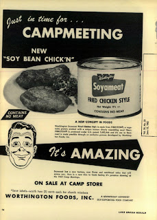
The ad above is for Soyameat - an unfortunately named "product" from 1962.

Go ahead and enlarge the ad - spend a few moments in wonder, disgust or oblivion...

Before we get to the ad's "Star," did you notice the number of times that 'meat' was cleverly alluded?  I found "SOY BEAN CHICK'N" to be fascinating.   It's as if removing the "E" makes the deception somehow fun.  Kind of like when taking a bite, scowling the face and crying, "But mo-om, you said this was chicken!"  And mom replies, "I did. It's ChickN.  Not ChickEN!"

Hilarity ensues.

And the photograph.  For a black-on-yellow job, it's rather brilliant.  It almost looks like Mee't.  Or mud.  No, that'd be Mu'd.   Oh well, if you read the copy, you'll see that it's actually FIBROTEIN®.  It's patented, by the way, so don't go thinking you can just go out in the backyard and make this stuff yourself.

Well, ok.  Here's the star.

THE GUY!  How brilliant is HE?!  Look.  I've done a few illustrations myself, hired some of the best in the business too.  And as an expert in authentic, genuine drawing, the artist positively NAILED the look of dad as mom just explained, "Honey, it's Soyameat!  Isn't it AMAZING?!"

Go ahead, look again.

Told ya.  It's perfect.

Btw - the Worthington Foods company is still in business.  Judging from the lack of stories about the horrors of Soyameat toxins, I suspect the company has got it figured out and it's probably better than edible.  But I'll be damned if that's the face I'd make...

http://www.worthingtonfoods.com
Monday, October 29, 2012

Daddy Saddle: dodged THAT bullet! (Whew!)


Is there an emoticon for "WHAAA?!?!"

Any good Revolutionary or Anarchist out there knows that the easiest way to ruin a culture is to introduce counter-culture ideas into the minds of its children.

Kenner - the company that brought us Spirograph®, Easy-bake-oven® and all those cool Star Wars figurines - was clearly part of the Communist plot to destroy American social order in the 1960s.

As a red, white and blue-blooded American dad, I find "Daddy Saddle" to be horrifying!  I work too dang hard to keep the little critters in control to let it all unravel in this gut-twist of authority.

Thing 1:  Daddy!  Let's play Horse!
Dad:  Sure!  It'll be fun!
(puts on Daddy Saddle)
Thing 1:  Wee!
Dad: Ouch, ouch, uh-oh...
Thing 1:  Faster!
Dad: Uh, time to put this away...
Thing 1: Awww...

(ten years later)

Thing 1: Dad, the meth party is at our house tonight.  And I want the fridge full.  Of steaks.  And don't go cheap on the beer.  And I expect you & mom will get a hotel room.
Dad: (to self) Woe! Woe!  And it all started out with a round of 'Horsey!

(shudder).  And I can hear just the sound of kneecaps being ground into crumbly pieces by the hard linoleum...

Thank goodness parents don't play with their kids anymore.

Whew.

Tuesday, October 16, 2012

They've scratched The Surface.


The ad above is for Microsoft's new tablet computer, "Surface."

Have a look.

|
|
|
|
|
|
|


BZZZZT!  (That's an alarm to wake you up)

Ok, this is what Microsoft does now that Steve Jobs is dead - they break out the creativity and go for the jugular vein!

The Microsoft iPad - er Surface - is so cool because it...clicks!

See?!  Get it?!  It clicks!   See?!  Because Apple customers are all googly-eyed for design over substance, right?!  And so instead of selling real features and benefits, they focus on the click because - as everyone knows - clicks are irresistible!

Hipster 1:  Hey Reagen.  Neat beret you're wearing.

Hipster 2:  Hey Josh.  It has a little snap, too.  See?  It clicks.

Hipster 1:  So COOL!  I want one!

Sigh.

The attempts at out-Appling Apple are silly.   If Microsoft really wants to hammer after Apple, go for price, go for user base, go for compatibility (ahem)...but trying to me-too the Lizard King of technology is like me walking up to Chris Brown and saying, "Yo!  How'dem bitches?!"

He'd probably hit me and I'd have it coming, too.

Anyway, I predict the market for people who want a tablet that CLICKS with switcheroo keyboards and covers is about ZERO.  Until they lower the price and say, "Everything the iPad does for $100 less!"

Then it'll scratch the Surface of the marketplace.   Until then - WE DANCE!


Saturday, September 22, 2012

The first ad agency run by Jr. High kids


The above screenshot is from Foxnews.com and shows either a shocking level of ignorance on the part of the Creative Team or that a group of Jr. High kids landed a really open-minded bank client - which would be a story in and of itself!

There it is - upper right - "Your dreams are too big to fail."

And there's the logo at the bottom of the ad, "1st First Dakota National Bank."

And the picture - a little kid with a big imagination going to big-places with his big dreams, pretending to be a big pilot!

Nice typography, great layout - shows acumen in designing web ads.  Unfortunately, the copy also shows a phenomenal lack of awareness of media, culture, client environment, business practices and the general economy.

Go ahead and Google/Bing/Yahoo/Aol-search the phrase, "Too Big to Fail."  Heck, ask the unemployed empty-nester down the street - you know, the guy that used to drive a new Buick every year but now rides his bike?  To volunteer at the Church...?

Clearly whomever took over this account has only achieved Situationally Awareness, recently.  As in, maybe, the past 18-24 months. I'm thinking the Creative Team is probably 13 or 14 years old.

However, getting back to "Too Big to Fail," the HBO series on the 2008 FINANCIAL COLLAPSE of INVESTMENT BANKERS is pretty good.  Watch the clip.

In the meantime, I'm thinking of approaching Jack In the Box Burgers with a contest idea:  every thousandth burger they make has a Golden Ticket secretly inserted into the wrapper.  It's good for prizes, cash... and we call the campaign, "Burgers so good, they're RARE!"


And, here are the covers for the book and movie.

Sunday, August 19, 2012

Younkers doesn't even seem to be TRYING any more.


A Sadvertising reader provided the Direct Mailer above - it's for Younkers' "august sale" that starts Wednesday, August 22.

It's also evidence - at least to me - that the company has outsourced their marketing to people who have no concept of clear English.

Firstly, the piece is prime evidence of some of the most gratuitous Couporn* on the market today.  It's got more come-ons than Bourbon Street at Midnight during trade-show season.  I counted at least FIFTEEN different examples of sales pitches based solely on pricing.

It's pretty clear that a brand is lost when the whole pitch seems to be about giving away margins.  I'd understand if this was some sort of "Crazy Days" that only comes once a leap year or so but to Younker's, this is just "august sale."

They're throwing around discounts like a summer camp food fight!

But look closely at the upper left corner - see the $10 Off headline residing above the incomprehensible logos of Younkers and sister companies?

Here.  I blew it up.  At least 140% too, btw...


WTH?

Get $10 off the next storewide purchase of $25 or more when you spend $50 anywhere in the store.

This strategy is bizarre and most likely a one-way ticket to Big Lots!  They're not selling clothes or home stuff any more but going for the kind of strategy that immediately puts the focus on GIMMEE GIMMEE.

Either Younkers has gone somewhat mad or they've farmed out their copywriting to people who clearly don't give a damn about what they're saying.


Saturday, August 11, 2012

Forever 21® lets their models be themselves.


The screenshot above is from Forever 21 - distributor of generally cool clothes.  Generally.

But, they also seem to be decent folk.  Or their Art Director is a lazy POS.

Ok - imagine you're a "Male Model" and you get the call - "Work!"

Immediately, visions of food - glorious food! - and gas and at last, a little cash for somethin' special like a toothbrush - spring to mind.  You don't think, you just GO!

The card says, "Forever 21," the people at the door seem friendly, the Assistant Art Director offers some coffee - glorious coffee! - and you're led into a dressing room with... "Sketched Floral Tank top."

Suddenly, you feel scammed.  "I gotta wear...THIS?!" And those skinny jeans feel just a little bit tight.  Paycheck's are overrated.

"NEXT!"

And POOF!  A few flashes, a few poofs of foundation and there you are, signing the freaking talent release.

WTH?!

Yep.  WTH, indeed.  Just look at that face - he's speakin' to the bro's back under the overpass - "Dude. I like...hate this gig.  But tonight, Micky D's on me!"

SALUTE mail model.  And DOUBLE salute to you lazy Art Director for letting the poor guy show us how he really feels about that gawd-awful tank top.


Wednesday, August 08, 2012

The rats have left Syria, leaving only the Amateurs.


The photo above came from the Syrian news agency, SANA.  It's part of a "story" on how Iran and Syria stand in solidarity bromance with each other in light of Syria's civil war.

On the right is Saeed Jalili, Secretary of Iran's Supreme National Security Council.

On the left is Bashar Assad, Syrian President.

In the middle is evidence that anyone with Art Direction skills have left the country.  The choice of furniture, background and strange, unarticulated poses are baffling - the scene is screaming, "Something awkward is going to happen any second!"


"Would you like a piece of pie?"

"Why yes!  I would like a piece of pie!"

or

"I am sorry."

"No problem!  We fart in our country, too!"

or

"I have an original Boba Fett action figure in mint packaging."

"Oh really now!..."

Would it have been that much trouble to stand out on a balcony and hold their clasped hands up high in celebration?   Or AT LEAST, put them in the back of a convertible and drive around the parking lot..

Instead, those that would NORMALLY be all Ga Ga about this glorious moment don't even get to the propaganda itself - they're stopped cold by the photo, cluck their tongues and smarm,  "Geez!  Look at those two dorks."

Say what you want about them Fascists - they sure knew how to cut a Photo Shoot.


Thursday, August 02, 2012

Inside Kristen Stewart's mind - the echo is deafening.


The graphic above is a screen-shot from somewhere inside today's Foxnews.com site.  It's an article from the ironically named "Dr. Keith Ablow."

Aside from having an outrageously funny headline... I had this visual of walking alone in a vast desert, the crunch of dried, cracked dirt underfoot and nothing but endless vista before me.

Aside from being poorly written... Here's the rule, Doc; if you post a picture of yourself with a blue power tie, you can't do "stream of consciousness."  I can.  But I wear hipster glasses, know the best wine for less than $6 a bottle and listen to indie music.  You, good sir, are bald and old.  Ick.

Aside from being a horrifying waste of time...

This article IS a brilliant example of how our news and information is being delivered peddled to us in this fantastic digital era.

"If Kristen Stewart is like the hundred people who have shared their personal, intimate thoughts with me..."

Oh sweet jeebus on a stick - this whole thing is an ef-fing AD!  And a crappily-written one, too.  I can find a hundred people to share their personal, intimate thoughts at the local soup kitchen.  And the keyword-laced copy reeks of correspondence-course SEO.

So.  Doc.  If you want to build a brand, there are a hundred ways to do it better than riding the coat-tails of a young woman who just wants to sleep her way up the flagpole.

In the meantime:

Kristen Stewart Robert Pattinson Obama Romney duel against Martian Aliens in 2012 against Syrian Forces breaking up global warming with Doctor Oz and Nate Berkus riding Oprah Winfrey's Kristen Stewart mind at Chick-fil-A gay homosexual chicken restaurants with late airline arrivals at all time highs to be attacked by Great White Sharks and Miley Cyrus may be pregnant with lucifer's step child.

There.  That should get me a bajillion hits.

Monday, July 02, 2012

It's good. But the GREATEST?!?!


The graphic above is a web-ad for AccuQuote.  They sell life insurance.  Apparently.

It's not a bad ad in terms of layout and design.  It's not great, though.  But that's not the point.  The point here is the Reach of the headline,  "The greatest gift I can ever give my family is life insurance."

Really?  I think the greatest gift the family can give the woman in-question is a trip to an Intervention as she's obviously about to do something stupid.  As in "terminal."  Why else would someone say such  hollow thing?

"Mom, can you play?"

"No honey."

"Teach me about life and stuff?"

"No honey."

"Help me with my coloring?"

"No honey.  I'm preparing to do something even better.   How about $500,000 payable on death?"

"Yay!"

Who are AccuQuote trying to reach?!  Clearly their market are the shallow, vacuous and totally-removed from reality.

I can see the train of mourners walking past the casket, all-smiles... each pauses, smiles and whispers, "Thank you."

Weird.

Saturday, June 23, 2012

You know what's UN-FAIR?!?


The ad above is from the "Un-fair" campaign running in Duluth, Minnesota.

Near as I can tell - besides generating a ton of publicity of the city of Duluth, Minnesota - it's supposed to make White people feel guilty because they're better than Black, Yellow, Brown or Green people.

I'm really trying to wrap my brain around this one - but I just...can't...quite...reason... bah!  I give up.  This must be how it feels to sniff glue.

Look.  I hate being a whitey of European descent.  I got no blues, my language is impossible to master, I like Buicks and my idea of egg rolls get baked in an oven.  And they're pizza flavor to boot.

Sometimes, the self-loathing is so bad, all I eat is Wonderbread, Swiss Cheese and Mayo.  Washed down with Chablis.

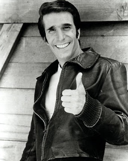
Plus, Fonzie was white.  And he was short!  (I hate tall people, btw.  They can reach stuff I can only dream about).  UN-FAIR.


Bah.

Dumb, dumb ad.  The equivalent of crying Fire in a crowded room then trying to rationalize the discontent by explaining, "Aren't you glad it wasn't real?!"

In the meantime, I just watched the clip below...RUN!  RUN!  To Canada!  Or Sweden!


Saturday, June 02, 2012

A brand so powerful, it's not even necessary.


The picture above is stuff  "Thing Three" swishes around in her mouth before spitting it out on floor, wall, mirror and sink.

Does it have a name?  Well, it does but apparently, the product name is not that important.  What IS important are these four things:

A.  The color blue
B.  Spongebob®
C. The words: Anticavity Kids
D. Saving 55 cents

Back in my day, Brands were developed to align a particular product to a particular customer.  For example, "Choosey mothers choose JiF Peanut Butter."  Only careful, fussy and quality-focused moms would buy JiF.

I remember looking up from my plate of burnt meatloaf and randomized place setting (I didn't see a two identical milk glasses until I left for Reform School) and having the epiphany,  "Ahhh!  That's why we buy Skippy peanut butter!  Mom just isn't the choosey type!"

Today?  I guess all that work on product naming, brand development and advertising isn't needed.  People will figure it out on their own.

But I have to say this - if my wife called me up to "...pick up some Blue Spongebob Anticavity Kids with a coupon" I know exactly what she wants.   But if she said, "...pick up some Act*." I'd probably reply, "What's wrong with the act I'got?!"

Anyway, it's summer - time to plan my:

A. Blue
B. William Shatner
C. Fighting
D. Cheap

But the Fam calls it "Vacation."


*I confess.  I peeled the coupon and discovered ACT® Anti-cavity rinse.  But I stuck the coupon back on so no one would confuse it with Windex®.

Saturday, May 19, 2012

Sweet JIMMINY!


Gawd, I live in a box.  And I'm so grateful.

Two days ago, sitting in the MSP Westin, my TV-deprived kids found this.

"Daddy?!  Is this why we're home schooled?!"

"Partly."

I'm happy to say, I once was blissfully unaware of "Sweet Genius" from The Food Network.

Now?  I'm scarred for life.  Bald gay guys with undeterminable accents freaked "The Fam" totally out... my 6 year old remains attached to the headliner of our minivan, held against gravity by the clenched grip of her little fingers...

Look.

I don't care if he's bald.

I don't care if he's gay.

I don't care if he can't speak in proper Minnesotan.

What I DO CARE about is the way he dismisses his minions to create "Sweet Genius!" food items via  ridiculous props (a conveyor belt and a big-red button?) and stupifying commands.  "Darkness!"

"You will use...mahshmallooos...und.... bacon fat!  And yo'ah eensparayshun?!  Eet iss... A HAMMER!"

I call BS.  For the past ten years, my wife has been blowing this poor goofball AWAY by making dinner out of stuff like American cheese, used green tea bags, 85% hamburger and saltines.

Her "eensparashun?!"   The fifteen minutes between finished-with-homework and dance-class-and-cub-scouts.

Reality TV sucks.

Sunday, May 06, 2012

HyVee Hexagons. Cutting...corners??


The picture above is from HyVee, a regional grocery powerhouse.  It's their house brand of Geometric gobbles - "Crispy Hexagons."

Back in the day, when companies were fat & rich,  "Marketing" and Intellectual Property (IP) attorneys lived large.  Names like Cheerios®, Kix® and Post Toasties® melded mouth and market-share.

Today however, money is tight.  Brand building takes time.  And everyone knows, all the really GOOD names (like music) were minted in the '60s.  Except Boo Berry®.

Anyway, I'm not holding my breath that anyone anywhere is saying, "Ya know what's just as good as Crispix® but fifty cents cheaper?  Hexagons.  The crispy ones..."

Or in my house, "Mah-oOOm, Kelsey ate all the HEXAGONS!"

"Did not!"

"Did too!"

"I hate Hexagons!"

"That's why you're stupid in Math!"

"Mah-oOOM! Paul's being mean!"

Oh - note to Art Director...you used an OCTAGONAL bowl!  Psssh.

I'm sooo looking forward for corporate profits again.

Saturday, April 28, 2012

I want my money back, Chevy.


The spot above is from a Chevy campaign.  It's designed to be a take-off of the once-popular show, "The Office."  It's a well produced, well acted, well directed bit of video.

But it sucks as a television commercial for a car company.

Why do ad-people do this crap?  And by "this crap" I mean this kind of oblique creative that has nothing to do with the product or the customer virtues...but instead, placates a Director's "vision"???

Catch a clue - American car companies have been RUN OVER by the Japanese, the Germans, the Koreans...and now FIAT, (Fix It Again Tony) is trying to come back to the U.S. car market.

And why are these OTHER nations' car companies so successful?  Because our car companies SUCK.  So much so that the fat cat 1%'ers had to show up in Washington D.C. a couple years ago and ask for a loan.  From you & me.

And them furriners make better cars, too.

Instead, we get high-concept barf like this - making dealers look ridiculous, not talking about the product and comparing themselves to a show that casts a cynical pal across the typical workplace.

Grrr.

We're not teaching (I mean ad schools, mentors, etcs) the Craft any more.  Instead, I get the impression that the next crop of Ad People are simply frustrated Lucas's who realize they'll never make Star Wars.  Instead, commercials will do.

Ok, Chevy.  Gimme $15K and I'll make you a kick ass commercial.

You're not listening.

And that's why I drive Mazdas, Porsches and Hondas.

Wednesday, April 11, 2012

"Where we goin' honey?"


The spot above is for Nissan.  They're launching "5 All-New Models."

And they're driving blind.

Yeah, I get the subtleties - Nissan is proud of their new models but can't quite release the details so they build the buzz by showing busy Americans sparked by the promise of New.

"Gary?  I got it!  This is what we do.  We keep our Media up by showing the cars we can't show...draped...by...a cloth!  And we'll show the good Folk seeing them drive by...reassured by the promise of all-things-Nissan!"


"Approved.  Now, getting back to your request for time-off next Tuesday...!"

Except.

If you & me (good Folk that we are) saw a car driving down the block draped in white cloth we'd call 911.  The imaginative among us might shout, "THE DEAD!  THEY DRIVE!"  But for the most part, we'd freak out - not smirk approvingly like the Talent did.

Look.  Driving cars that are wholly draped through neighborhoods is not exactly cheap.  I bet it cost Nissan at least $900 in extra animation time...at least I think so.  Gawd-forbid they did that for real.

But the lame creative tells me two things.  1.  Nissan didn't bring their A-team in on the 5-new-car-Creative.  2.  Nissan didn't ask their legal team the ramifications of showing their cars riding through suburbia cloaked in white sheets.

So.

Did you see the Mazda spot?


Saturday, March 17, 2012

Now THAT'S creativity!


Here's how it went down. I just know it.

Account Executive:  Well, their #1 product quality is cleansing skin.

Creative Director:  Well, what's hard to clean off skin?

Account Executive:  Motor oil?

Creative Director:  No...think harder.

Account Executive:  Animal guts?

Creative Director: No, stupid! Atomic radiation!

Account Executive: Why...it's....GEEEN-YUS!

Fast forward five years, deep in the bowels of a Madison Avenue ad agency, a once perky blonde uses her tentacles to sort mail and new-hires are warned, "Don't go down to the basement." 

Saturday, February 25, 2012

Is Brawny Mitt Romney? (say it fast! It's fun!)


I didn't ask the question, but once posed, I think you can understand why it became the most compelling  command of the past :15 seconds.

"Is Mitt Romney the Brawny Man!?"

Or, stated in a much more lyrical fashion,

"Is Brawny Mitt Romney?"

Well, as you can see, I tried to find out.  And the result was...a waste of time.  Thank you, Sadvertising reader.  I'll never get those 15 seconds back.

However, if "Is Brawny Mitt Romney?" turns into a campaign slogan, he better pony-up with the cash or else my lawsuit is gonna' leave Mitt's bank account a bit SCRAWNY.

Anyway, this all brings up an interesting point -  "What happened to the other Brawny guys?!"

Well, I bet Left Brawny's still there, workin' on the Camaro, helpin' Karen at the grocery store once'n'awhile...

Right Brawny, on the other hand, prolly left the forest to open up that "fun dance club with a Tapas Bar and a Ricky Martin lookalike contest!" that Left Brawny was always a little creeped out about hearing.

"Look dude.  I don't own any cutoffs and I'm not going to make any cutoffs cuz I'm not going to wear any cutoffs.  Now just shut up and cut wood!"


Monday, February 20, 2012

The Google has spoken - let the Hoarding begin!


The article above is from the Chicago Trib - it announces Mars (Candy Bars) intent to discontinue their king-size bars and replace them with smaller ones maxed at 250calories.   Ostensibly, it's part of Mars' "commitment to health."  

More likely, it's a fear of rising ingredient costs and a vision of a future where anyone with a BMI greater than 24 needs permission from their health-insurance carrier before buying a candy bar.

Whatever.  I smoke cigars and welcome my new hand-to-mouth friends into the Ring of Persecution.

Anyway, the point here is to look at the Google ad that popped up when the algorithm of Message met Monetization.

Did the Google God tip its hand?

Clearly this is cause for concern - no, depression!  But for whom??  For the sugar-jacks who will soon have to buy TWO Mars Bars instead of one?  For the money traders who know the Chocolate Index as the true indicator of economic health?


Or the Priests of Psych who sit upon the truth - that, "These (3) signs of Depression Are A Clear Sign of Depression."

It's coming people.  It's coming...


Tuesday, February 14, 2012

Don't type with your mouthful.


The bag of crunchy somethings above is from HyVee - a midwestern grocery store chain.

Let's see.

They got Tostados - bite size, white and yellow ones.  Nice for decorating, I bet.

They got Tortilla chips, too.  Ranch, Nacho and "Restaurant Style 100% White Corn." Hmmm.  They're right.  I've never, ever seen Ranch or Nacho chips at a self-respecting restaurant.  (make mental note of this Quality Indicator).

And, they got Corn Chips.  Just Corn Chips.  Your basic Chips of Corn.   Nothing more, nothing less.

Up until now, I was tracking along the Brand.  But suddenly, someone found the Can of Adjectives and had a PARTY!

Get a mouthful of these names -

Cheese-Eze Puffed Cheese Flavored Corn Snack
Krunch-Eze Crunchy Cheese Flavored Fried Corn Snack
Butter Flavored Pop Fresh Baked Corn Pops
Cheese Flavored Pop Fresh Baked Corn Pops
Cheese Balls Backed Cheese Flavored Corn Snack

"Bill, I think I've got it!  We should call them Cheese Eze Cheese Puffed Corn Flavored Snacks!"


"We can't, Tom.  Just got back from Legal, Tom  It turns out that's trademarked."


"Dangit!  All the good names are TAKEN!"

These are the most bizarre names I've seen in a while.  And how are kids supposed to get addicted to salty snacks with names that require a cheat sheet?!"

"Mo-om, could you get some Cheese Eze Crunchy Punchy Funchy Grunch..."

"Spit it out, honey..."

[patoooey]

"Pringles.  I want Pringles."


Friday, January 13, 2012

Look Clem - I think they want somethin'!


The ad above is authentic.  It's a tourism ad for North Dakota.

Two guys, three 'gals.'

The copy reads, "Drinks, dinner, decisions.  Arrive a Guest, Leave a Legend."

You know what the "Decision" was?  Deciding which Gal had to drive them all home.

And the "Legend"?  Well, in North Dakota, husky girls and awkwardly dressed men can find each other.  At least if they're walking in front of the right window.

Mystifying, really -  with other potential Tourism topics like, "Going to Rummage Sales,"  "Church Pancake Dinners" and "Heading into Town to Get Supplies," why did they pick, "Bang on the Window for Alcohol"?

"Look Lorie!  One of them has a BEER!"
"Hand's off - he's MINE!"

(giggle giggle)

North Dakota.  Arrive a Guest.  Leave A Tip.

UPDATE:  It gets weirder - the ad is targeted at CANADIANS (click)!   And you know those Canadians - they'll do anything for beer.

Mercedes Kampf


"Yes.  Yes!  Yes!!  Che's our man!"

So.  You're Mercedes Benz and you're making a presentation at the gigantimundo Consumer Electronic Show (CES) and want to make a point that you - like all the cool gizmos at the show - are REVOLUTIONARY.

So, you send your 20-something Creative Team to google "Revolutionary" and voila.

Still wondering why putting the iconic face of Cuban "Revolutionary" Che Guevara into your Powerpoint is a bad idea?

He pushed Communism into the bellies of the Cuban people, ushering a Totalitarian regime that's killed thousands and stripped the freedoms of millions.

And why Che when you've got the Premier Brand of dictators right in your backyard?!?

And he was a Mercedes-man, to boot.


Wednesday, January 04, 2012

You know in some parts, 2 outa 3 ain't bad.


The above photo was sent in by a Sadvertising reader - it's a Cracker Barrel gift-card from one of them-there gift card racks that are everywhere.

"Eat, Shop.  Relax, it's good for both."

Oh the vagaries of punctuation and typography, eh?

1.  You can Eat, then Shop...but you'll be stressed as Hell.

2. You can Eat and Relax...but afterwards, you can't shop (because you fell asleep and closed the place down?!  "Gawd...last night me'n Goober closed CRACKER BAR'L!  Day-um!  Whoo-hoo!"

3.  You Shop, then Relax.  But you can't eat.  I wonder why not?  Maybe cuz you're sick of the freaking place?  "Gawd, if ah'see one more Cin-mun bun candle, ah'm gonna PUKE!"

But then again, maybe...Cracker Barrel knows something about its customer's ability to count.

Certainly they need to learn a thing or two about how to position and punctuation headlines.

I'd have done-it lahk this...

Eat.  Shop.

Relax - you can do both!

Yes. Yes! YES! That's how it WORKS!!


The graphic above is real - it shows the use and result of the "Shape Up Body Pad."

It's so messed up.

Are you hearing the squishy, slurpy sound effects as the woman drops the slug into her pants?

*slurpglurpflurp*  Then the parasite takes hold - the deal with the devil complete!  In exchange for sumptuous curves, the creature attaches itself, forever one with the new host!

"Lauren...it's time to steal again.  Master says so!"


"No!  NO!  I won't, I just WON'T!"


"Look.  You want a butt or not?"


"Yes Master. (sigh)  I'll take us to Wal-Mart. "

Mwaa-ha ha ha!

In the meantime, a woman with such an impossibly NON EXISTENT BUTT doesn't need a silicone slug to drop into her pants.  She needs to eat it.