Wednesday, March 29, 2006

Good Mornin'...ya liddle CHICKS! *hick*


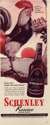
The graphic above is an ad for Shenley's Whiskey. It was published in a June 1945 edition of Life magazine.

Ah, the 'Good Ole'Days' - when days began with bright promise and a belt of booze. Specifically, Schenley Reserve!

We can only assume that ole'rooster has had his morning nip - why, he's already hollerin' at the kids.

Dad Rooster: "Sthing a Sthong of Sthunny...*hick* G'dam*d Morning, ya liddle whinin' sh..."

Chicks: "Waaaaah! Mommy! Daddy's had too much of his special medicine! Waaaah!"

At any rate, we'd NEVER see this for Seagrams or Crown Royal today. If we've learned anything in the last 60 years, it's that mornings need to be started with CAFFEINE!
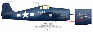


PS - this post is in honor of my friend Col. Bruce Porter - WW2 ace fighter pilot. He painted a big ol'bottle of Schenley's on the side of his F6F-3N night fighter. After flying combat all night long over a black ocean, a sip of Schenley's after landing would have been understandable.
Well, at least we've weeded out the scary ones.


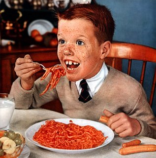
The above graphic is a photo taken for Franco American (the people who make Spaghetti O's) in 1957.

Evidently, if you conceived a child near a nuclear testing facility in the 50's, they had an appetite for worms.

But that's not the gross part. Notice how the "spaghetti" seems to be trying to escape the coming maw. They're alive?! Or, that's some really stiff spaghetti. OR, that "child" is moving his fork awfully darned fast.

Anyhow, we can only hope the "spaghetti" is soft because those teeth are really better suited for cut and slash processes - you know, like attacking people as they walk past the swing set, then retreating to the sand box while the victim bleeds to death. (I learned about this technique on Discovery Channel's Shark Week!)

So, the point is this - we don't see kids like this in ads anymore. Flouride, dentistry, hair cair products and Adobe Photoshop® have sure raised our aesthetics.

Thanks to www.plan59.com for the graphic.


Oh. Is that a hot dog he's got in his mitt?! 3 hot dogs and a pound and a half of "spaghetti"??!?!

Monday, March 20, 2006

We're havin' SNACKS!


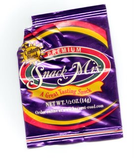
The above graphic is a package of "snacks" that I received aboard an Alaska Air flight.

What are they? Why, they're Snacks, of course. You know - Snacks!

A "mix" of Snacks, actually. Premium ones, too. And in case you're still wonderin', these Snacks are Great Tasting. And, you should also know something else about these Snacks - these Snacks are a "Custom Blend"! Imagine - a Custom Blend of Snacks! You won't find another bag of Snacks like these Snacks, anywhere else!

Obviously, some person of refined tastes oversees these particular Snacks to make sure they meet a high standard. The graphic designer also holds these Snacks in high esteem - note the Purple bag = Royalty - red & yellow accents add for excitement...THIS MUST BE THE GOOOOD STUFF! There are "snacks" and then there are THESE Snacks.

If you show up at the Oscars or at The White House and ask, "Where are the snacks?" You'll be served THESE Snacks. Probably.

What are they? They're SNACKS!

All this writing about Snacks is making me hungry...(time warp to call home to see what's for dinner).

Ooooh! We're having FOOD tonight. Premium, custom-blended FOOD!

Oh'yeah...a big, steaming, hot plate of FOOD.

Want some Food?

Wednesday, March 15, 2006

CNN - The Most Trusted Name in Time Travel"™


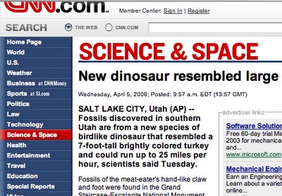
The above graphic is from a CNN.com post on the discovery of a new dinosaur.

Did you know the new dinosaur was "brightly colored"? CNN does.

Evidently, "The Most Trusted Name in News" got its slogan from developing some pretty fantastic means of reporting.

He he...I have this vision of a hookah pipe sitting in the middle of CNN's news bureau while sitar music boings away in the background...

Saturday, March 11, 2006

Unforgivable - the cologne for the cold and lifeless.


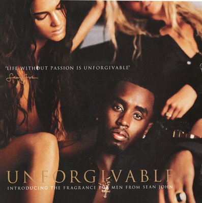
The graphic above is from a Younkers™ ad flyer - it's a promo piece for "Sean John's" new cologne, "Unforgivable."

Ya'know, if Mr. John walked into my office with the burning desire to create a personal fragrance, I would have...


A. ...suggested a different name than a name that represents the final judgement before being cast into an eternity of horror.

B. ...chosen a different photo than the one that looks like I'm snuggling down with a bunch of dismembered women.

C. ...told the woman in the upper left to cop a different vibe than the "I'm gonna cut you!"-thing she's got goin' on.

D. ...suggested he not try to spell "Orgy" with the lame-ass art direction (come on, ad people - it's funny in the conference room, but it just makes us all look stupid in the next industry-expose-d'jour book).

AND THE GRAND FINALE...

E. ...suggested any quote other than, "LIFE WITHOUT PASSION IS UNFORGIVABLE."

According to Mr. John, a dispassionate life of boredom is the heart of his cologne.

That's right - "Life without passion" is about his cologne, Unforgivable.

I've butchered my share of words in my career, but I haven't yet tried to kill a product with its own slogan.

Well...

Maybe...maybe I'm being a little harsh.

On second glance, look at Mr. John's face. Surrounded by what appear to be gorgeous half-naked women...he looks rather, well...passionless.

Hmmmm.

Maybe he's just being honest.

And honesty in advertising? That's forgivable.

Thursday, March 02, 2006

Target: WOMEN.


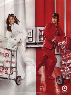
The image above is an ad for Target® and it was found on the back of a Northwest™ Airlines in-flight magazine.

It's a brilliant ad and I hate it, too.

It's brilliant because it captures a vibe so darned well - red, white, hip, fun, with-it. It's also a visual burr; dangit if it's extremely difficult to keep from looking at the thing. There are so many questions, unfinished stories in this ad, it's impossible not to wonder...

Who are these people?
Why do they need warehouse dollys?
Why are they running?
Why is there a pay-phone?

Good photography, excellent art-direction and amazing copy (he he).

It's brilliant! Really...and I'm not just stating that. This is a very, very good attention-getting ad. Target is fighting for the same customer as Wal-Mart. If it were your choice to identify with a Wal-Mart customer versus one of these hip, with-it Target customers, who would you choose?

Exactly.

But, the guy?

He's...well...well...well...well, judging by his legs, I figure he's not making much money as a male model - at least he's not spending his money on food. I'm wondering if he's got the muscular ooomph to push that cart very far at all.

And his "I-cut-my-hair-with-some-shards-of-glass-I-found" hairdo doesn't do the ad any good, either.

Oh well. Guys aren't this ad's target audience - women are. And this is the guy that Target chose as a good guy to put on an ad that targets women.

So. This is the guy.

THE guy.

This is the Target guy.

No muscle, no tone, bad hair.


Honey, I'm finally HIP!