"Branding" is an essential discipline in modern communications. From automobiles to burgers to world-terror, interested audiences & consumer groups are constantly filtering a barrage of information to pick the brands that resonate, lead and inspire.
Mercedes does a great job of branding. Everyone knows Mercedes is a quality, prestige car.
McDonalds does a great job of branding. Everyone know's McDonalds is consistent, fast food.
Nike does a great job of branding. Everyone knows Nike is footwear worn by great athletes.
Even "Barney" is a great brand. Everyone knows the purple dinosaur means fun for toddlers.
Al Queda - the terrorist organization - has been trying to build their global brand as a retro-idealist anti-American group since at least September 11th, 2001 and frankly, their efforts suck.
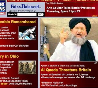
Al Queda - the brand - needs a dramatic makeover if it's going to compete in the global marketplace. The photo above tells all...these guys just can't seem to market themselves out of the 16th Century!
Using the Biblical example of the Good Samaritan, the following advice/critique is offered.
1. Ditch the name.
It's unpronounceable. "Al Kayduh"? "El Keyeduh"? "El Keeda"? It's also too vague. With the Palestine LIberation Organization (PLO), everyone knows the mission - liberate Palestine! But as it is, the name Al Queda is a better name for a cosmetic.
Skin cream: "Al Queda - moisturizing, with Aloe."
Gay cologne: "Al Queda - the romance of 101 Arabian Knights!"
Shampoo: "Al Queda - fortified with amino essence for thicker roots."
2. Get a consistent spokesperson.
First it's an old guy. Then a young guy. Then THIS guy. Just who is the face of Al Queda?! Maybe they're having trouble staying in one place or maybe the membership list is changing fast. Dunno. But Al Queda could get a better face. They need to find the "Ronald McDonald" of terror.
3. Ditch the attitude.
The raised finger has got to go - it's a gesture that has too narrow of an appeal. It reeks of "dysfunctional dad" and considering Al Queda's preference for recruiting young idealistic males, it's a turn-off. I can just hear it, "Shut UP! I KNOW how to strap the stupid bomb on, OK?!"
4. New clothes. Now.
The black/white dicotomy is inconsistent with the single-focused message. Try a single, primary color like yellow. And the turban is either done well or not-at-all. The Hindus have great turbans - they're tall, white and look great with a big'ole ruby or emerald in the middle. The Al Queda variety looks like it was thrown-on on the run.
5. Lock up the guns.
First, the AK-47 is too 60's - an era that is becoming universally acknowledged as just plain dumb. "Tune in, turn on and drop out" of the old-style blow-back recoil, heavy cartridges, guys. Al Queda needs a weapon that says "now". Think "lightsaber".
6. Publicity photos! (not on-the-fly candids).
It's the same shot - yellling man appearing to be saying "AAAAAAAHHHH!" or "OOOOOOOOOOOO!" Al Queda needs to think about some thoughtful, well-lit black and whites. Plus the poofy-hair around the lips make it look like they've been trying to kiss bees.
(sigh)
That's enough freebie advice. I have one more key/mission-critical point that will guarantee the long-term positive impact of the Al Queda brand, but considering how fragmented and disorganized they are, it won't be of any use unless I can get them to sit down in one place for a meeting.
That's right...every single living Al Queda member needs to be in the same place, at the same time to hear it.
Yep. The same geographical, physical coordinates. Every last one of them.
Then, and only then, can we change the Al Queda brand into something positive.
Of course, once we get them in one place, we'll need a whole bunch of security... ;)

