Sunday, July 18, 2010

Thou shalt not necessarily believe in logos.


The graphic above is the logo for American Atheists.

It's also a very clear example why there are logical steps to follow in this business that so-often gets tangled up in subjective, emotional thinking.  Yeah, designing a new logo for a client is probably the Holy Grail of all work, "See that sign?  It's MINE!  Mwaaahahahaha!"

Logos are silly, fun, controversial...but there are rules to their creation.

Whether you believe in God or Not, graphic designers need to believe in basic Reason.  Aside from appearing to be lifted from a DEVO album (ironically, they had an excellent sense for graphic design) the AA logo fairly states that their deity is the St. Louis arch and the Helium atom.

Some day, some Atheist family is going to show up at NASA on a Sunday morning and have their faith shattered when there's no carmel rolls or singing.

What appears to me is that the designer laid out a Christian crucifix, Jewish star-of-David, Muslim crescent and morphed them when the right answer was there all along...


nothing.

Tuesday, July 13, 2010

Be Prepared.


The above screenshot is from a CNN story on a Facebook widget that allows Indian people to lighten the skin in their Facebook profile shots.

Never mind the fact that Vaseline is using this widget as a viral to promote their line of skin-lightening creams.  However, it's nice to see that vanity is just as vacuous on the other side of the world.

What I find strange is the copy and slogan - "Transform your face on Facebook with Vaseline Men  - Be Prepared."

I'm sure something is lost in translation here and from the copy.  But do Indian men really want to look like sun-starved Brits?!  If so, the first thing I'd suggest is to wipe that satisfied smile off the face of the model and replace it with a proper English scowl.

I'm also a little lost in the product name - "Vaseline Men."  Clearly, I'm not a "Vaseline Guy."  Frankly, I don't want to be.   Nor have I been tempted.  Ever.   Now, Old Spice?  Yeah.  I even wore Aramis bronzer once (it was Halloween and I went as a Jersey Guido).

And, I'll go out on a limb and speak for approximately 90% of men and state that I've never heard anyone state or even hint that they wanted or needed Vaseline anything.

However, the strangest aspect of this s-ad is the slogan - "Be Prepared."  Essentially, the slogan states this:  Be ready to appear Caucasian.

Do I hear the clomp-clomp of jack-boots?  Geez.  All I can state is that I'd have had serious trouble working on this account.  Or, I'd have gone the extra mile and branded Vaseline Men hair bleach and blue contact lenses.

PS- A sadvertising reader pointed out the Indian caste-system favors lighter skin.  Still... Again, "Vaseline Men" remains a strange name and India should remember Michael Jackson in their prayers. 

PPS - judging from the responses received, it seems the whole world wants to be white.  Wow.

Wednesday, July 07, 2010

Need to reach YIA's? Buy TIME.


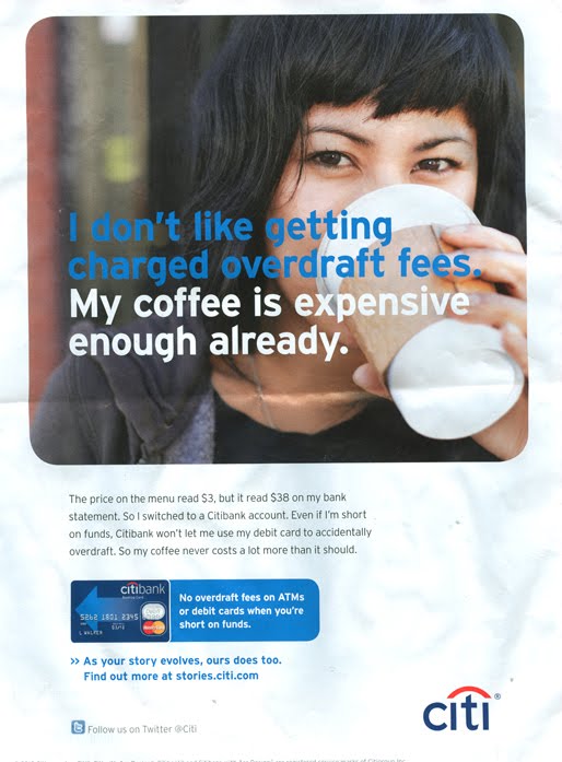
The s-ad (new word!)  above is from June 28, 2010 issue of TIME magazine.  It's for Citi.

Just this morning, I read a magazine trade advert that touted the magazine's ability to reach certain markets deeper and more intentionally than other advertising mediums.  Looking at the ad above, I'm fairly confident in the assertion that TIME magazine readers are stupid addicts.

Here's the headline:  "I don't like getting charged overdraft fees.  My coffee is expensive enough already."

Then there's the body copy:  "The price on the menu read $3 but it read $38 on my bank statement.  So I switched..."  STOP.

In other words, Miss Withdrawal had less than $3 in her account and she still tried to get her Java On.  Or, in OTHER words, another failure of our educational system is on the loose.

OR IN OTHER WORDS...

(Citi Marketing Department)

Executive:  Jenkins!  We need to grow business!  Gimm'me a new market!
Assistant:  Well, sir...there's the YIA's.
Executive:  YIA?  Sounds intriguing!  Who are these YIA's??
Assistant:  Young Irresponsible Addicts, sir.
Executive:  Ah.  Good.  And how do we reach these YIA's?
Assistant:  TIME Magazine, sir.  I suggest front inside cover.

(slaps forehead)

Of course, Citi played it safe here - stupid people who spend money they don't have on stuff they don't need aren't likely to be insulted by the obvious.  Or 18% interest charges.

OH!! And here's the kicker - the last line of copy reads - "So my coffee never costs a lot more than it should."

No, not a LOT more.  Just more.

Sweet jimminy, I gotta get me a coffee shop.

Saturday, June 19, 2010

Pretty-much sad...vertising.


Last week, "the worst gig in advertising" came up in conversation and we all pretty much agreed that it'd be Yellow Pages sales.

But, they have a niche - people without computers or cell phones.

Gotta have a niche these days, eh?

Friday, June 18, 2010

Now THAT'S an attractive box!


The ad above is for Orbit gum.  It came from.... I can't recall right now.  But that's not important.

Neither is that this ad is a thickly veiled poke at sex - there are at least three such references here.  Yawn. What's truly sad here is that the ad is about...printing.  Ink on stock, look-for-the-union label, take it to the die-cutter PRINTING.

(I'd insert crickets chirping here, but they've died of neglect.)

Sweet jimminy - are things so boring at the Wrigley Company that the ad people have to strap a corset on their spokesmodel to brag about the printing? Make no mistake about it - the compelling message here is that Orbit has a printed box.  In this case, a green one with little scab-like things on it.


"Gary.  What'cha chewin?"
"Orbit"
"Day-um!  You must'a made sales quota this week!  What's it like?!"
"Well, you know...(clears throat) they DO make an attractive box." (snicker)

Wait!

This just hit me.  You don't think that Orbit customers were standing there in the C-store gum aisle, trying to figure out what to do with their box, do you?

"Wm Wrigley Customer Service, how may I help you?"
"I'm standin' here...wonderin'...like...what is this?!"
"It's our Outer Wrapper™!  Remove it to find something surprising underneath!"

(crickets chirping...)

"Wow!  Four color, two PMS colors and an emboss!"
"Surprised?"
"Hell yeah!"
"Tell your friends about our box,'k?"
"oooooh yeah..."

Friday, June 04, 2010

The Mother of Invention.


The graphic above is for the "Easy-Out" eyeball repositioning tool.  Now you know: there's enough of a market 'out there' for a company to market a gizmo that allows doll lovers to change/reposition their toy's plastic eyes.  Free-enterprise is a powerful force, eh?

However.

You know...I'm sitting here...trying hard to write...but something about that photo just keeps distracting me...

Ok.  I figured it out.  It's the brilliant way the Art Director has us notice the company - "Bloomers*n*Bows."  I'd have never thought to use a one-eyed mutant baby to call out the company logo, that's for sure.

But, to quote a client, "That sure makes the ad 'Pop!' doesn't it?"

(sigh)

Thursday, May 27, 2010

I'm not THAT comfortable.


Every ad agency has this story - someone walks in with The Greatest Thing Ever!

And the conundrum begins:

Do you take their money? (and your kids get to eat)


or...

Send them to the competing agency down the street (and your kids get to make fun of their kids during recess).

You decide.

Butt...one thing has me thinking. The video states that "Comfort Wipe" is the first improvement in Wiping Technology (WT) since the 1880s.

Maybe they're right. Grandma always talked about how valuable "that old Sears Catalog" was back in the outhouse. Too bad all we have today is Direct Mail postcards. 

And those postcards are not good.  Not good at all.

Ha ha.  "Potty Humor" is officially banned for the rest of 2010.  


Tuesday, May 18, 2010

Still #1 in fresh breath.


This really isn't "sadvertising," but it still fits.

The scan above is the overwrap from Delta Airline's amenities bag listing Contents and Country-of-Origin.

As "amenity bags" go, it's a Beaut!  The socks are especially nice with little rubber grippers for, presumably, when the airplane's in a 90 degree bank and one still needs to walk up to the "labratory."  (as my middle child used to call it.)

Let's see...  Reading down the list, China, China, China, China, China, China, China - OH!  Greek lotion!!  Italian lip balm, China, Thai toothpaste (!) Chinese ear plugs...but!

Wait!

There's Good Ol' Uncle Sam making a play at the mint market.  Damn!  Nothing like genuine American breath mints.

Now, I know America is focused on too many more important things than manufacturing the paltry contents of a silly little freebie.   After all, it's just stuff, right?   Plus, the Greeks are legendary for their lotion, right?

But I'm wondering.  Are American mints so good China simply can't compete or could it possibly be that an American company figured out a way to out-cheap China...?

I wonder if, 50 years from now, a Chinese businessman is sitting in First Class eating Chateaubriand, sipping Bordeaux casually reading the origin-source of the amenity bag...

United States, United States, United States, United States, United States, United States, China, United States...

I hope the Thai's still have the toothpaste market though.

Sunday, May 16, 2010

No. Please DON'T set your sights.


The photo above is a billboard from Sioux Falls, South Dakota.  It's promoting the "Opener" of the Sioux Falls Pheasants - a minor league baseball team.

For the unenlightened, Pheasants - a game bird noted for being colorful and tasty - are a big part of the South Dakota's tourist income.  Hunters flock to the state from all over the world in the hopes of experiencing Pheasant hunting at its world-class best.

So, I can see how it falls to mind to honor the bird by naming the local ball club, "Sioux Falls Pheasants."

But what doesn't make sense is this billboard.  "Set Your Sites" it states, next to the smoking end of a shotgun barrel.

Hmmm.

Naming the local team after a game bird that's seasonally shot & eaten for sport is one silly bit of logic but this billboard fairly asks for mayhem.

"Ladies and gentlemen...NNNoooowwwWWW annnnnnnouncing!  The SURVIVING LINEUP of the SOoooOOO FALLLlllLLSSS PHEASANTS!!! (cue organ music, crowd cheers, shotgun blasts...

....ambulance wailing...

...kids screaming...

drunk guys hollering, "Ah gaht one!  Ah gaht one!"

Friday, April 30, 2010

Well isn't this just about the most disturbing thing...


Yeaaahhhh.  Riiiight.

Well, THANK YOU VERY MUCH mister 1950s Art Director.  It looks like we'll be seeing ANOTHER warning label on packaging...