Sunday, August 08, 2010
Ladies. I simply had...no idea.
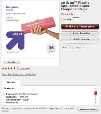
This morning, I happened to look over my bride's shoulder as she thumbed through the week's stack of junk mail. To my surprise - shock - horror(?) she paused over a Target® coupon page that featured their "up&up" brand of tampons.
I saw the arrow pointing at the clutch-purse-case and gasped.
"Are those things THAT BIG?!?"
Sweet jimminy. Those up&up tampons are bigger than a Coney Island chili dog!
We men simply have no idea what you ladies go through. Again, I bow to my wife for her regal decorum and sheer ability to endure.
Or, the graphic designer was a guy.
Update: A Sadvertising reader just remarked that it took a bit of time to absorb this post. (knee slap) Funn-nEE!
Another update: A Sadvertising reader offered up a .jpg of the 40ct package. Man! That clutch is NFL regulation! "Hut! Hut! Girlfriend! Go long - this one's going up & up!"
Monday, August 02, 2010
Because you SHOULD, that's why.
The billboard above is for a western Iowa hospital.
It's also an indicator that hospital marketing has entered a new phase of hubris, authority and...strangeness.
Maybe it's just me, but the masked 'caregiver' with the gothic eyeliner doesn't say "Mercy" at all. More like, "Dis vill make you TALK you enemy of ze STATE!" Or maybe remove my spleen, sew me up and leave me half-conscious in a Baja bar with a note pinned to my chest, "Warning. He has no spleen any more."
Regardless, the S-ad part of this billboard is the copy. "Is Mercy Your Hospital? It Should Be."
No discussion. No features. No benefits. No nuthin'. Just, "It Should Be."
Geez. That had to be a short brainstorming session, eh?
Yeah, as a medium, Billboards favor brevity. So, the Mercy Folk should have just stated, "Come here, not there."
Or maybe more appropriate, "Sick? Here."
Subscribe to:
Comments (Atom)


