Sunday, December 26, 2010

The Hell Panda! Merry CHRISTMAAAARRRRGH!


Is a product "Sadvertising"?  Yes.  It is when it scares the wits out of your child.

This little gizmo found its way into Thing 3's stocking.  A cute little Panda keychain (Thing 3 owns no keys, btw) with - what's this little button here?  Let's just push it...

WWLAAAAH!  WHAT THE HELL IS THIS?!  Possessed Panda from the Underworld!?

"Daddy!  Make the bad Chinese exporter stop!  Make him stah-ah-ah-ah ahhhhhp! (inhale, WAHHH!)"

Or maybe it's a carefully disguised self-defence device.

Anyway, this piece of evil has got to go before Thing 2 figures it'd be fun to sneak to school and freak out the playground.

Thursday, December 23, 2010

What happens in the Caymans, stays in the Caymans.


The scan above is an ad taken from last month's Redbook(?)  Of course, the ad is to promote tourism to the Cayman Islands.

Aside from being grammatically incorrect*, the headline promises: "Where once in a lifetime happens everyday."   I hope not.

Firstly, swimming with Stingrays is pretty cool.  For having the ability to kill Wildlife Experts like Steve Irwin, they're rather professional and only envenomate people when molested.

So, why does it appear that Mom is getting zapped out of her mind because of Dad's reckless and (in many countries) deviant behaviour?

I guess for the two kids, the Caymans will live up to the promise.  Dad's in jail for life and mom's in a coma.

*Every day.  Two words, not one.

Tuesday, December 21, 2010

Chocodooby. My Christmas gift to Ad People.


The ad above is an old one, but I still remember the first time I saw it years ago.  Since then, I've been jamming pipe cleaners soaked in gasoline through my sinuses in an effort to clean my brain.

Naw.  Just kidding.   This is my Xmas gift to all in the Biz who are struggling right now with that Genius idea and the Faith that the client will buy it.  Rise up, oh hopeless, oh cynicized, oh beaten-down Creatives.  It can happen.  You can sell anything you set your mind to.

Including a giant gibberish-speaking testicle that sells food and toys.

Thank goodness Europe has socialized medicine.  If this would have aired-big in the United States, it could have brought down the system in a single "Weeeeeee!"

"Doctor!  This...this...this horde!  They keep clawing at their eyes!  What do we do?!"

"Barricade, nurse.  And head to the heliport, stat!"

PS - Kinder Eggs® are the BOMB.  And I want that airplane.

Wednesday, December 15, 2010

A big drink of Cigar Box


A sadvertising reader sent this to me.  "Do wine descriptions count as Sadvertising?"

Sweet jimminy on a stick, they sure do!

Melange Noir - 2007


Tasting Note:  Aromatic ripe berries and spice marry with light cedar notes.  A well rounded palate of black and cigar box leads to lingering tasted oak on the finish.


In other words - this plonk tastes like burnt wood.  Order the Crown & Coke.  There should be a licensing process before allowing people to use words in public, don't you think?

"...black and cigar box leads to lingering..."

[slaps forehead]

[again]

Thank you, sadvertising reader!


Sunday, November 28, 2010

A BLAST to your FACE! Yeah!


The scan above is a direct mail piece I received yesterday.  It's for a new Schick® razor that I'll be trying tomorrow morning, for free!  Yay!

But don't be surprised if I'm forever changed by the experience.  In fact, I'm a little scared (but I'm going through it because Fear is bad and it's not going to cost me any money).

Poor Schick® - they've struggled at being #2 to Gillette forever.  Maybe it's the lack of slotting fees, vibrating blades or Sicilian connections but it sure isn't lack of trying, hence the giveaway.  And I'm "in" - the kids have been warned that this afternoon is "Trip to Target® day!  Yay!"  (collective groan response).

Or it could be their weird Creative.

Firstly, their slogan, "It's like a blast of hydration to your face!™"  This has to have been thunk up by women because to a man, a blast of hydration to the face is followed by a charge and a right hook to the kidney. It's the law of summer water fights.  And any self-respecting man who rubs his cheeks after shaving complaining of, "Hydration issues" is probably too weenie to be trusted with sharp metal anyway.

Bah. I know a man who spent a week in a WW2 jungle and he shaved every day using a dull razor, skin oil and rain water.  I can only imagine the dumbfounded stare he'd give me if I asked, "Bill, how did you deal with facial hydration while you were behind enemy lines?"

Weirder yet is the ™ mark - clearly, some Creative Director thought, "No one's gonna steal that slogan from us, it's just too good!"  Good luck on the "blast to face" brand extension.


Anyway, secondly, the OTHER slogan is even more thought provoking - "Free your skin®."  This one is ® too.

Mirror check.  Stare deeply at our parched cheeks and repeat after me:  "My skin needs to be freed."  From the rigid confinement of muscle tissue?

I guess those Schick™ razors are pretty sharp!

Maybe this is where the Hydration comes in?

Note:  A Sadvertising reader - a 90 year old man, no less, just responded to me with this:
      
One day I read where using water was just as good and a lot less expensive.  Remembr, I grew up during the Great Depression.

Well, I started shaving in the shower with water pouring over my face keeping it real wet as I made strokes with my razor.  It worked.  No pain.  Good shave, no delayin trips to the hotel gift shop.  I still do it.  I have not used any kind of shaving cream i in 50 years.  Also,  I dry my razor after using and change blades about once a month.

Not sure this would be satisfactory for a man with a real fast-growing, heavy growth of facial hair, but it works for me.  I shower, shave and exercise in the shower every morning  (hip squats and toe-touching)  Just became 90.

Friday, November 26, 2010

Depressing?


The ad above is for "Abilify" - it's a drug that - apparently - helps depression drugs work better.

This post came from a suggestion of a Sadvertising reader.  Typically, this blog is uproariously funny and I wallow in the accolades of "Ha ha" like a media buyer rolling in bonus spots. Or a pig in mud.  You pick.

But, this ad isn't so much a lampoon of a Creative, Art or Copy director as it is to how little is known about Depression and how to treat it.  How do we know?  Read the copy.

"Approximately 2 out of 3 people being treated for depression still have depression..."

The sadvertising reader asked, "So, 66% of depression treatments aren't working?!"

Now I know where all the burned out Ad people go...product development for Big Pharma.  With Media the way it is now days, they're probably looking at a 33% hit rate and thinking it's like Direct Mail in the 80s all over again.

Happy Days!

PS - I just had an idea.  Why not stuff $5 bills into the bottles?  Just imagine the Focus Group on that one - "So, how did you feel when you found a bunch of money in your bottle of MegoFlux?"  "I felt...great!"  "Whoa! 10 for 10!  Call the FDA...and the Copywriters!"

Sunday, November 07, 2010

Yes.


The photo above was taken at a trade show.  I know it's "for real" because I took the photo.

Folks, I'm here to tell ya' - it's that easy.  You know that famous silicone lawsuit of a few years back?  Pointless.  Needless.  You babes needed only Chesty Chewing Gum.

And you know, the code was buried there all along - Mastication (for chew)  Mastos (Greek for breast)... geez.  This is like the Bible Code only happier!

Being a victim of the upper-Midwest, I knew by experience that the more women chewed, the bigger their boobs got...but so did their butts.  And their ankles.  I've seen'em at pizza buffets, chewin' and chewin'...

However the Natural Burst Company has the magic numbers dialed in - reference the nubile (at last, a reason to write 'nubile'!) woman who is obviously placing her faith in Chesty.  Let's hope this is a "before" shot.

Tuesday, November 02, 2010

Level 4! All the way!


The video above is for the "i-JoyRide Exerciser."  It's a clip from a Canadian shop-at-home television show.

Go ahead - click Play.   I'll wait.

[Twiddles thumbs, whistles]

So.  Wha'dja think?

Two quotes made me think.  The first one was:  "This is been a great thing for my boys and I to do when they get home from school..."  Yeah.  And as soon as your boys bring home a buddy or two, you'll have them lined out the front door.  "Hey.  Let's go and watch Billy's mom exercise some more!"

The second one was pertaining to having guests over for dinner and inviting them to ride the i-JoyRide.  Certainly - especially if you're also demoing how to clean vomit out of carpet.

Want more?  (hint:  go to :50)  For some reason it just makes more sense with a Brit accent.

Sunday, October 31, 2010

Poor Frank.


The graphic above is from an email received from Giants Sunflowers.

Double-click the graphic - if you dare - to get a closer look at the Frankenstein-guy.  Instead of being frightened at his reanimated corpse-ishness, he kinda looks...sad.

Looking at our Malaise-minded Monster, I'm thinking he'll break out into tears at any moment.

'Course, if I were forced to wear that ill-fitting hat, I'd be bummed too.

Thursday, October 28, 2010

Watch your back, yes. And...maybe the History Channel?


The graphic above is a direct mail piece created by a marketing company working on behalf of North Carolina Legislator, Tim Spear.

I think the message is clear - Spear is a Democrat who's watching the "backs" of veterans.

Only these veterans are not veterans.  They're WW2 reenactors.  And they're not American reenactors but Germans.  And, if we're being nit-picky, these Germans are fighting for Hitler.

Ah, Hitler.  The man who exterminated millions and completely buzzkilled an easy-to-care-for mustache for the next six hundred years.

Of course, the marketing company is all over with the mea culpa's.  But, how on earth do you apologize to a client for THIS?

Ad guy:  "Hey.  Spear dude!  'Sup?!"
Spear:  "Uh...just working on trying keep my job.  'Sup with you?"
Ad guy:  "Uh.  We put Nazis on your postcard."
Spear: ----- (sfx of man faceplanting)

All in all, this error is a simple one.  However, it does illustrate that no one at the firm bounced the concept off of anyone who knew anything about the Military...which is especially ironic considering the headline:

"In combat, you always want another soldier covering your back."

At least a soldier who isn't the freaking ENEMY.  Oh well, maybe the Graphic Designer is a Republican.   Or, for the geeks among us, a National Socialist.

Wednesday, October 20, 2010

This is ONE way to win a taste test. I guess.


The screenshot above is from Pierre Foods - a manufacturer of, well, food.  The crude drawing of a sickly green person getting ready to Ralph is mine.

For a company that can run a dang-fine cover shot like the one shown, they're danged insecure about their hamburgers  I mean, comparing their COOKED burger to a "leading raw burger?!"

(scene: Corporate guy with clipboard, in a Mall, behind two plates)

"Ok, mom. Would you rather serve your kids this sizzling burger or patty up some of this raw stuff and risk spending 4 nervous weeks as your kids fight for life against e-coli poisoning?"

"Uh...I'll take the cooked burger!"

"YAY!  We win!  Again!  We're great, we're great nananana boo boo We're Great!  Again!"

And evidently, the Pierre people took this bizarre taste-test on the road - nationally.

"Ok, now what's better - our tasty chicken sandwich or this fistful of poultry intestines?"

"YAY!  We win!  Again!  We're great, we're great nanana..."


NOTE:  A Sadvertising reader just offered the following factoid:  1:3 still preferred the RAW BURGER.

Saturday, October 16, 2010

MY GOOD CARPET!


The graphic above is a scan sent to me by a Sadvertising reader who received it in a "card-deck" mailing to his home.  Suffice it to state, it's for a company marketing "Outdoor Gear."

Regardless, you're looking at one of the hardest-working pieces of paper this side of a dysentery ward (or a political flier - same thing).

Sweet jimminy - we've got a Goth babe (with hip dysplasia?), FIRE - LOTS of FIRE! -  no less than five fonts, a ginormous pizza oven with FIRE - LOTS of FIRE! and good ole' Shep holding a dead pheasant.  On white carpet.

I feel like I just washed my eyes with Red Bull.

Oh.  Wait.  I'm re-reading now... oh!  Well, duh.  I should have read the copy first.  It's "Not your ordinary Hunting Sale!"

Well alright then - they're marketing Un-ordinary.  Everything makes total sense now.  In that case, the only change I would have made would be to add a Cadillac Escalade with 25" bling rims somewhere.  Maybe too a picture of Grizzly Bear.  And maybe a stack of $100's and a bottle of Jack Daniels.  But that's just me.

However, the sadvertising reader who contributed this piece offered this commentary:

"That dog is going to be in deep (doo), on several fronts. First, he dragged this dead bird inside on the nice white rug. Second, Jasmine's obviously in The Mood For Love, since she has her lacy see-my-(breasts) top on. Notice how ticked she looks that this mutt is interrupting her romantic evening. And it must be evening since there's a nice fire in the fireplace. So where did the dead bird come from? Last I checked, you can't shoot them at night. Maybe Bob was one rooster over the limit so he chucked this one in the ditch on the way home earlier in the day, and now Ol' Brainless goes and sniffs the damn thing up and brings it back."


(LOL! - thank you Sadvertising Reader who professes to be a rabid hunter with insistence upon excellent outdoor gear, taste in fine women and hunting with dogs who know better than to bring dead game into a house).

Thursday, October 14, 2010

Hey babe. Nice femur.


The screenshot above is from today's GAP home page.  It features a guy who looks like he just left a pool bar at 2am and...

(sweet jimminy)

...a dead chick.  There's no way she survived the photo shoot - that grin on her face cost about 10 calories and I'm figuring she was down to her last 9.

And the Photoshop is pathetic, sculpting her "legs" into something akin to antennae from a Martian spacecraft.

"GAP"?  Heck yeah. If she squeezed her butt cheeks together, they wouldn't hold a packing peanut.

Maybe I'm biased because I remember the sound of all the machines "that went ping" while my sister was hospitalized for bulimia.  But 'round here, that ain't no woman, it's a corpse.

Oh well.  You know the starving - they work cheap.

Wednesday, October 13, 2010

Alas, poor Microsoft.


WARNING:  Do not be deceived by the NPR-level haughtiness hereby offered.  Just because it involves esoteric (and perhaps pithy, ne erudite) critique of corporate giant Microsoft's clumsy communique, doesn't mean it ain't useful to us reg'lr folks.

The series above is from a sadvertising reader - it's from a web-mercial promoting Microsoft's new flight simulator, "Flight."

Describing the video - a series of text screens fade-in/out over passing of clouds; the lines are simple, profound - meant to be read a'la Morgan Freeman.  The effect?  Magical.  Sensory - one can almost feel as if one is flying!  At the end, the viewer is struck by anticipation, reeling in the promised WONDER.

Nothing sets the tone like Shakespeare.  Eh?  Pour the Bordeaux into the Riedel - spread the Camembert, we're going deep...

And now begins the legendary hooey from Microsoft's marketing department.

"There's this line from Shakespeare..."

Oh geez.  As soon as someone states that, the pretension starts to bubble like gas from canned chili.

"My soul is in the sky."

Oh geez x 2.  The line isn't from "Shakespeare" - it's from his play, "A Midsummer Night's Dream."  You knew that right?

"You know the feeling."

Sweet jimminy.  I hope not.  Because the line is uttered after one of the main characters STABS HIMSELF and then utters, "Now die, die, die, die, die."

Of course your "Soul is in the sky."  You're dead, silly.

Time out.  Yeah, yeah, only one out a million know anything about AMND at all.  So why dredge up the arcane and throw yet another rock at the mighty tower of Microsoft's marketing department?  Because this screen was sent to me by a Sadvertising reader who found it on an aviation blog frequented by - you guessed it - flight sim users!

It looks as if Microsloth simply "googled" (or Bing'd?) quotes on flying, found one, looked at the clock, saw it was 4:15pm on a Friday and got'er done.  I'd expect this kind of sloppiness from someone like me, but Microsoft?!

Beware copywriters - there may be Shakespeareans among your target market.  In the meantime, Microsoft would have better quoted Poe.  He would have appreciated "Blue screen of death."

Sunday, October 10, 2010

Something for the Search Engines...


Actually, a fantastic stack of Sadvertising is within spitting range right now, but it's going to be a few days before it can be posted.

So, in order to keep my Google rankings higher than roast-beef flavored toothpaste, have a watch of this genius monstrosity.

Tuesday, September 14, 2010

"Share of mind" permanently, indelibly.

The graphic above is taken from a Noble Roman's sell-sheet touting their food program for people wanting to get into the pizza and sub business.

Did you notice the generous serving of pepperoni on the pizza?  Perhaps the attractive visi-cooler showing both pizza and sandwich?  How about the pricing strategy - 2-fer $10.99 is an interesting upsell and 3.99 HAS to be competitive in the sub market.

Oh...and look at the header copy:  "Award Winning!"  and  "Made Fresh Here Daily!"  Excellent that the company has achieved notoriety for their food and the apparent commitment to quality

Yes.  Yes!  Noble Roman's appears to be doing their best to capture their share of a competitive market.


PS - I don't know about you, but there's something about Noble Roman's that scares the LIVING BEJEEBUS out of me.

AAAAAAAAAAAAAHHHHH!

(deep breath)

AAAAAAAAAAAAAHHHHH!

Sweet jimminy, I'm glad I "just said No!" to that LSD offered to me on the school bus otherwise I'd probably be hanging on to the ceiling by my fingernails.

Saturday, September 04, 2010

Drake goes for an untapped market.


The graphic above is a screenshot of Drake University's home page.  It touts their new marketing campaign promoting the "Drake Plus" advantage.

Obviously, high academic standards are not one of their advantages.   In fact, Drake is content to say, "We're upper-below average."

And therein lies Drake's genius - going straight for the market that no other University has dared to target - under achievers.  Of course, Drake's smart in going for the best of the underachievers - the solid D+'ers - but it's still a risky move because it assumes their market knows how to read.

However, I showed this to my kid and he uttered the catchphrase of today's youth, "FAIL!"

Thanks to the Sadvertising reader (an educator, no less) for letting me know.

NOTE - The frame below is also from their website.  The copy HAS to be someone's idea of a last-day-on-the-job prank because it simply can't get any more upper below-average.

"Breaking through the box.  Analyzing every angle.
Serving up a different point of view.  It's what you do.
It's why you're not just thinking "a great education." That's a given.
No, you're looking for the + factor.
Welcome to Drake.
An experience where every single thing connects to who you are.  And what you want tomorrow to be.
D+.
When it comes to choosing the college that fits you best, there's simply no  higher grade."

Sunday, August 08, 2010

Ladies. I simply had...no idea.


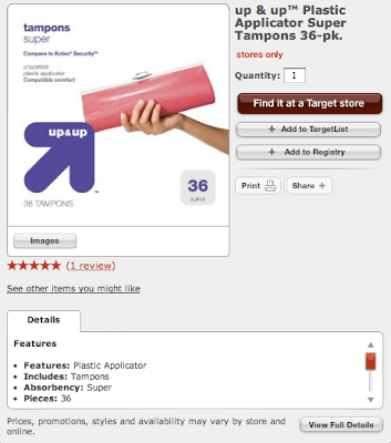
This morning, I happened to look over my bride's shoulder as she thumbed through the week's stack of junk mail.   To my surprise - shock - horror(?) she paused over a Target® coupon page that featured their  "up&up" brand of tampons.

I saw the arrow pointing at the clutch-purse-case and gasped.

"Are those things THAT BIG?!?"

Sweet jimminy.  Those up&up tampons are bigger than a Coney Island chili dog!

We men simply have no idea what you ladies go through. Again, I bow to my wife for her regal decorum and sheer ability to endure.

Or, the graphic designer was a guy.


Update:  A Sadvertising reader just remarked that it took a bit of time to absorb this post.  (knee slap) Funn-nEE!

Another update:  A Sadvertising reader offered up a .jpg of the 40ct package.  Man! That clutch is NFL regulation!  "Hut! Hut! Girlfriend! Go long - this one's going up & up!"


Monday, August 02, 2010

Because you SHOULD, that's why.

The billboard above is for a western Iowa hospital.

It's also an indicator that hospital marketing has entered a new phase of hubris, authority and...strangeness.

Maybe it's just me, but the masked 'caregiver' with the gothic eyeliner doesn't say "Mercy" at all.  More like, "Dis vill make you TALK you enemy of ze STATE!"  Or maybe remove my spleen, sew me up and leave me half-conscious in a Baja bar with a note pinned to my chest, "Warning. He has no spleen any more."

Regardless, the S-ad part of this billboard is the copy.  "Is Mercy Your Hospital?  It Should Be."

No discussion.  No features.  No benefits.  No nuthin'.  Just, "It Should Be."

Geez.  That had to be a short brainstorming session, eh?

Yeah, as a medium, Billboards favor brevity.   So, the Mercy Folk should have just stated, "Come here, not there."

Or maybe more appropriate, "Sick?  Here."

Wednesday, July 21, 2010

YES! YOU! COULD!


The above photo is a picture of a bag of "Scoops" snacks from the Frito Lay® corporation.  It was sent in by a Sadvertising reader (release on file).

Let's just let it out; some lucky - damn lucky - soul out there is going to be a MINOR LEAGUE BASEBALL GENERAL MANAGER for a whole WEEKEND!

Can you imagine!?  The winner might get to negotiate with foodservice vendors, walk around the empty locker room (when no one's even there!) and order extra business cards!

"Mommy?  Who's that mysterious man who just told that custodian to pick up the candy wrapper?"
"Hush child.  That's the GM!"

I know the rejoinder I'm using at the dinner table tonight - "No we're not going to Mall! What do you think I am!? A MINOR LEAGUE GENERAL MANAGER?!"

Frito Lay® could have gone the extra light-year and offered the winner a shot at the MAJOR league spot, but in this economy, I reckon it's tough to budget for Tupperware bowls full of coke, private jets and stripper-fueled weekends at away-games.

I will tell ya this, though.  When Target® offers the chance to be an Assistant Health & Beauty Manager for a Monday, I'm going to score AXE samples for all my friends.  Every one!

And maybe some cadmium-free jewelry for the little lady waitin' back home.  Yes-sir.

Sunday, July 18, 2010

Thou shalt not necessarily believe in logos.


The graphic above is the logo for American Atheists.

It's also a very clear example why there are logical steps to follow in this business that so-often gets tangled up in subjective, emotional thinking.  Yeah, designing a new logo for a client is probably the Holy Grail of all work, "See that sign?  It's MINE!  Mwaaahahahaha!"

Logos are silly, fun, controversial...but there are rules to their creation.

Whether you believe in God or Not, graphic designers need to believe in basic Reason.  Aside from appearing to be lifted from a DEVO album (ironically, they had an excellent sense for graphic design) the AA logo fairly states that their deity is the St. Louis arch and the Helium atom.

Some day, some Atheist family is going to show up at NASA on a Sunday morning and have their faith shattered when there's no carmel rolls or singing.

What appears to me is that the designer laid out a Christian crucifix, Jewish star-of-David, Muslim crescent and morphed them when the right answer was there all along...


nothing.

Tuesday, July 13, 2010

Be Prepared.


The above screenshot is from a CNN story on a Facebook widget that allows Indian people to lighten the skin in their Facebook profile shots.

Never mind the fact that Vaseline is using this widget as a viral to promote their line of skin-lightening creams.  However, it's nice to see that vanity is just as vacuous on the other side of the world.

What I find strange is the copy and slogan - "Transform your face on Facebook with Vaseline Men  - Be Prepared."

I'm sure something is lost in translation here and from the copy.  But do Indian men really want to look like sun-starved Brits?!  If so, the first thing I'd suggest is to wipe that satisfied smile off the face of the model and replace it with a proper English scowl.

I'm also a little lost in the product name - "Vaseline Men."  Clearly, I'm not a "Vaseline Guy."  Frankly, I don't want to be.   Nor have I been tempted.  Ever.   Now, Old Spice?  Yeah.  I even wore Aramis bronzer once (it was Halloween and I went as a Jersey Guido).

And, I'll go out on a limb and speak for approximately 90% of men and state that I've never heard anyone state or even hint that they wanted or needed Vaseline anything.

However, the strangest aspect of this s-ad is the slogan - "Be Prepared."  Essentially, the slogan states this:  Be ready to appear Caucasian.

Do I hear the clomp-clomp of jack-boots?  Geez.  All I can state is that I'd have had serious trouble working on this account.  Or, I'd have gone the extra mile and branded Vaseline Men hair bleach and blue contact lenses.

PS- A sadvertising reader pointed out the Indian caste-system favors lighter skin.  Still... Again, "Vaseline Men" remains a strange name and India should remember Michael Jackson in their prayers. 

PPS - judging from the responses received, it seems the whole world wants to be white.  Wow.

Wednesday, July 07, 2010

Need to reach YIA's? Buy TIME.


The s-ad (new word!)  above is from June 28, 2010 issue of TIME magazine.  It's for Citi.

Just this morning, I read a magazine trade advert that touted the magazine's ability to reach certain markets deeper and more intentionally than other advertising mediums.  Looking at the ad above, I'm fairly confident in the assertion that TIME magazine readers are stupid addicts.

Here's the headline:  "I don't like getting charged overdraft fees.  My coffee is expensive enough already."

Then there's the body copy:  "The price on the menu read $3 but it read $38 on my bank statement.  So I switched..."  STOP.

In other words, Miss Withdrawal had less than $3 in her account and she still tried to get her Java On.  Or, in OTHER words, another failure of our educational system is on the loose.

OR IN OTHER WORDS...

(Citi Marketing Department)

Executive:  Jenkins!  We need to grow business!  Gimm'me a new market!
Assistant:  Well, sir...there's the YIA's.
Executive:  YIA?  Sounds intriguing!  Who are these YIA's??
Assistant:  Young Irresponsible Addicts, sir.
Executive:  Ah.  Good.  And how do we reach these YIA's?
Assistant:  TIME Magazine, sir.  I suggest front inside cover.

(slaps forehead)

Of course, Citi played it safe here - stupid people who spend money they don't have on stuff they don't need aren't likely to be insulted by the obvious.  Or 18% interest charges.

OH!! And here's the kicker - the last line of copy reads - "So my coffee never costs a lot more than it should."

No, not a LOT more.  Just more.

Sweet jimminy, I gotta get me a coffee shop.

Saturday, June 19, 2010

Pretty-much sad...vertising.


Last week, "the worst gig in advertising" came up in conversation and we all pretty much agreed that it'd be Yellow Pages sales.

But, they have a niche - people without computers or cell phones.

Gotta have a niche these days, eh?

Friday, June 18, 2010

Now THAT'S an attractive box!


The ad above is for Orbit gum.  It came from.... I can't recall right now.  But that's not important.

Neither is that this ad is a thickly veiled poke at sex - there are at least three such references here.  Yawn. What's truly sad here is that the ad is about...printing.  Ink on stock, look-for-the-union label, take it to the die-cutter PRINTING.

(I'd insert crickets chirping here, but they've died of neglect.)

Sweet jimminy - are things so boring at the Wrigley Company that the ad people have to strap a corset on their spokesmodel to brag about the printing? Make no mistake about it - the compelling message here is that Orbit has a printed box.  In this case, a green one with little scab-like things on it.


"Gary.  What'cha chewin?"
"Orbit"
"Day-um!  You must'a made sales quota this week!  What's it like?!"
"Well, you know...(clears throat) they DO make an attractive box." (snicker)

Wait!

This just hit me.  You don't think that Orbit customers were standing there in the C-store gum aisle, trying to figure out what to do with their box, do you?

"Wm Wrigley Customer Service, how may I help you?"
"I'm standin' here...wonderin'...like...what is this?!"
"It's our Outer Wrapper™!  Remove it to find something surprising underneath!"

(crickets chirping...)

"Wow!  Four color, two PMS colors and an emboss!"
"Surprised?"
"Hell yeah!"
"Tell your friends about our box,'k?"
"oooooh yeah..."

Friday, June 04, 2010

The Mother of Invention.


The graphic above is for the "Easy-Out" eyeball repositioning tool.  Now you know: there's enough of a market 'out there' for a company to market a gizmo that allows doll lovers to change/reposition their toy's plastic eyes.  Free-enterprise is a powerful force, eh?

However.

You know...I'm sitting here...trying hard to write...but something about that photo just keeps distracting me...

Ok.  I figured it out.  It's the brilliant way the Art Director has us notice the company - "Bloomers*n*Bows."  I'd have never thought to use a one-eyed mutant baby to call out the company logo, that's for sure.

But, to quote a client, "That sure makes the ad 'Pop!' doesn't it?"

(sigh)

Thursday, May 27, 2010

I'm not THAT comfortable.


Every ad agency has this story - someone walks in with The Greatest Thing Ever!

And the conundrum begins:

Do you take their money? (and your kids get to eat)


or...

Send them to the competing agency down the street (and your kids get to make fun of their kids during recess).

You decide.

Butt...one thing has me thinking. The video states that "Comfort Wipe" is the first improvement in Wiping Technology (WT) since the 1880s.

Maybe they're right. Grandma always talked about how valuable "that old Sears Catalog" was back in the outhouse. Too bad all we have today is Direct Mail postcards. 

And those postcards are not good.  Not good at all.

Ha ha.  "Potty Humor" is officially banned for the rest of 2010.  


Tuesday, May 18, 2010

Still #1 in fresh breath.


This really isn't "sadvertising," but it still fits.

The scan above is the overwrap from Delta Airline's amenities bag listing Contents and Country-of-Origin.

As "amenity bags" go, it's a Beaut!  The socks are especially nice with little rubber grippers for, presumably, when the airplane's in a 90 degree bank and one still needs to walk up to the "labratory."  (as my middle child used to call it.)

Let's see...  Reading down the list, China, China, China, China, China, China, China - OH!  Greek lotion!!  Italian lip balm, China, Thai toothpaste (!) Chinese ear plugs...but!

Wait!

There's Good Ol' Uncle Sam making a play at the mint market.  Damn!  Nothing like genuine American breath mints.

Now, I know America is focused on too many more important things than manufacturing the paltry contents of a silly little freebie.   After all, it's just stuff, right?   Plus, the Greeks are legendary for their lotion, right?

But I'm wondering.  Are American mints so good China simply can't compete or could it possibly be that an American company figured out a way to out-cheap China...?

I wonder if, 50 years from now, a Chinese businessman is sitting in First Class eating Chateaubriand, sipping Bordeaux casually reading the origin-source of the amenity bag...

United States, United States, United States, United States, United States, United States, China, United States...

I hope the Thai's still have the toothpaste market though.

Sunday, May 16, 2010

No. Please DON'T set your sights.


The photo above is a billboard from Sioux Falls, South Dakota.  It's promoting the "Opener" of the Sioux Falls Pheasants - a minor league baseball team.

For the unenlightened, Pheasants - a game bird noted for being colorful and tasty - are a big part of the South Dakota's tourist income.  Hunters flock to the state from all over the world in the hopes of experiencing Pheasant hunting at its world-class best.

So, I can see how it falls to mind to honor the bird by naming the local ball club, "Sioux Falls Pheasants."

But what doesn't make sense is this billboard.  "Set Your Sites" it states, next to the smoking end of a shotgun barrel.

Hmmm.

Naming the local team after a game bird that's seasonally shot & eaten for sport is one silly bit of logic but this billboard fairly asks for mayhem.

"Ladies and gentlemen...NNNoooowwwWWW annnnnnnouncing!  The SURVIVING LINEUP of the SOoooOOO FALLLlllLLSSS PHEASANTS!!! (cue organ music, crowd cheers, shotgun blasts...

....ambulance wailing...

...kids screaming...

drunk guys hollering, "Ah gaht one!  Ah gaht one!"

Friday, April 30, 2010

Well isn't this just about the most disturbing thing...


Yeaaahhhh.  Riiiight.

Well, THANK YOU VERY MUCH mister 1950s Art Director.  It looks like we'll be seeing ANOTHER warning label on packaging...

Monday, April 26, 2010

Sienna - the Minivan for MEN! DAMMIT!


The ad above is for the Toyota Sienna minivan.

What happened at Toyota?  They used to make reliable, well-made cars suited for sensible citizens.

"Wow, Gary.  That white Camry looks nice!"

"Yep.  It's got a sun roof, too."

"Wow.  Open it once, 'k?"

"Sure!"

Then, someone in the Brand Department must have decided to add a little "edge" and soon, Toyota was accelerating down the fast track to...this.

The hip slogan (in hipply understated typography) reveals the target audience - frustrated male minivan drivers.    The New Sienna Minivan.  Daddy Like.

"Daddy Like."  Ah, dad.  Slopped forehead, hairy knuckles, monosyllabic.   Definitely a Neanderthal.  Only three things on dad's mind - beer, mom and, "GAWDDAMMIT!  GET YOUR SH*T OFF MY (@*#$& LAWN!"

Hence the headline, "Anger Management."

Now, Toyota mitigates the Male Driver temper by putting a camera that sees THAT GAWDAMN (@*#&$! FENCE! or SWEET JEBUS ON A @(*&$#~! STICK WHO PUT THE TRASH CAN THERE?!?!

Boy, I bet the family's happy now.

"Mom?  Why does daddy swear so much?  Is it because he got passed over for The Promotion again?"

"Hush hush!  We can barely afford this lease as it is!"

Thanks for thinking about Us Men, Toyota.

Now fix your @#(*$&#@! gas pedals so they don't kill anymore people.

Assholes.

Saturday, April 10, 2010

Just buy it.


The scan above is an insert that appeared in (I think) the recent Woman's Day magazine for Marcal brand recycled paper products.

Did you ever see the movie "A Christmas Story"?  Though the film is basically one brilliant scene after another, one of the stellar moments is when the little boy finally receives his Little Orphan Annie Decoder Ring and discovers that his heroine is really a marketing farce.

"Be sure to...drink...your OVALTINE!?"

Yeah. We all laughed. Those Ovaltine bastards, charming a kid with the lure of drama and intrigue only to find out it was all sadvertising.

Well, the subliminal Sadvertising forces drew me to this one like a wasp to orange soda.  Maybe it was the "100% Free" headline, maybe it was the photo of the suspiciously Satisfied Guy.  Whatever.  The BS Meter was in full-on Berzerker mode from first glance.

The Satisfied Guy is none other than Tim Spring, CEO of Marcal company.  He's an "Avid Hiker and Conservationist."  He's also rather brazen for 'one of them-there nature people.'

The quote:  "If everyone buys just one roll of our paper products by Earth Day, we would help save 1 million trees."

Is that all it'll take? Just buy?  JUST BUY?  EVERYONE?!

Why didn't he just write:

"If everyone BUYS just one roll of MY paper products by Earth Day, I can go hiking and conserving in Patagonia with the Bambi Twins."

Yeah, yeah - I saw the Freebie offer and really, it became null and void as soon as Mr. Tim's goofy quote registered.   And the million trees is ridiculous because there's no way to know exactly how many "everyone" really is.

No matter.  The brand name is called "Small Steps."  Geez. I wonder what Tim's got up his sleeve for when he's ready to take bigger steps - maybe he'll have goons in dark glasses slapping black police batons at the paper aisle end-caps?

"Hey. Lady.  Buy this.  Doooo it."

Friday, March 19, 2010

Written with Real Fruitiness-ness.


The ad above was placed by Kellogg's for it's Pop•Tarts® snack-things.  It's in this month's Family Circle.

The Art Direction here is rather good.  It caught my bloodshot eye anyway.  I bet it gets almost as much attention as "What your refrigerator says about your sex life" and "Ten ways to feed your family for less than a dollar a day."

However, notice the headline.  Now, everyone knows that Pop•Tarts are about as nutritious as white bread dipped in Vodka.  So when I read, "Baked with real fruit" my BS meter started gurgling.  And sure enough, there at the bottom ('cuz Kelloggs is big enough to have lawyers on staff) was the clue - a disclaimer.

Here it is:

*Filling made with equal to 10 percent fruit.

Read it again.   Now read it again.  Ok, one more time.

You're confused aren't you.  Go ahead admit it - there are religious prophecies worded with greater clarity than that.  And after reading the disclaimer, the headline takes on a whole new meaning - "Baked WITH real fruit" could mean that Kellogg's pulled an office chair next to the assembly line, set an apple on it and called it Truth.

See, Kelloggs could have written, "Fruit filling contains 10% fruit."  or  in the case that each flavor had a different percentage for fruit (as if Wild Grape would have wild grapes anywhere, anyway) "Fruit content may vary."

But no, they wrote:  Filling made with equal to 10 percent fruit.

It's like they're referring to some other ethereal substance that is not fruit but can be equated with fruit.  At least 10% of fruit.  Ack.  My head hurts.

Whatever, Kellogg's slogan is "Made for Fun®"   Well, maybe made for equal to 10 percent fun.  More or less.  Sort of.

Monday, March 15, 2010

Leaving tracks.


The picture above is the lid from a container of Blue Bunny ice cream.  Blue Bunny ice cream is pretty good ice cream.  Of course, even bad ice cream is pretty good.  Unless its meatloaf ice cream.  That's not so good.  But anyway...

"Bunny Tracks®" ice cream, as a flavor, is pretty good.  It's got, "Vanilla Flavored Ice Cream with Thick Fudge and Peanut Butter Caramel Ribbons, Chocolate Covered Peanuts and Peanut Butter Filled Chocolate Bunnies."

So why give it a poopy name?  And I suspect last-day-on-the-job art direction.

I'll assume the brown smear across the mound of ice cream is the Bunny Track?  If it is, that bunny has dysentery and shouldn't be anywhere near food.  Or maybe those lumps are the Bunny Tracks®...if so, I bet that bunny can run a heck of a lot faster now that it's dropped 10% of its body weight on the spoon.

Being fair, cutting through product clutter is a roll of the dice.  The reward of success is like Vegas - big enough to try, but the last statistic I read on new-product introductions is that 19 out 20 fail.  Even understanding that Bunny Tracks is probably a promotion product, scatological tactics are a sign that something in the Creativity Department needs to be flushed.

Even stranger is that Personals - the brand line for this particular product - appears to be aimed at women.  Maybe I'm hangin' with the wrong group of gals, but they don't find dookie appealing at all.

"Bunny Tracks is Sadvertising for the the same reason Boeing doesn't name its passenger airplanes "Lawn Dart" or Estee Lauder doesn't sell "Meatloaf" perfume.

Geez.  Rocky Road sounds rather upscale about now.


UPDATE:  Two Sadvertising readers have responded - one said SHE almost bought some for her husband.  Then another let me know about Pig Trail ice cream.  I'd imagine Pig Trails are somewhat more substantial than Bunny Trails.


Saturday, February 13, 2010

You say Bologna, I say Ralph.


The scan above is an ad for Oscar Mayer Bologna.  "Beef" bologna to be precise.

Ahh. Bologna. The first true, authentic "Mystery Meat."  What gives bologna its pinkish, gelatinish, meat-like substance?  Or the ability to remain fresh months, years...decades after being exposed to the elements?

You don't know, do you!  Ha.  Me neither.

Back in my latch-key days, buddy Dave proclaimed, "Hey!  I can make boloney taste good!"  Of course, being 12 and fascinated with things like UFO's, Bigfoot and other impossibles, said, "WOW!" And, he showed me.

His secret?  Fry it!  Dave flapped down a slice of the stuff on a hot frying pan - SSSSS!  The fat bubbled off and left behind a maroon disk about the size of a can of chewing tobacco.  And...it was good!  Yum, yum - we went through the whole pack.  Sssss!  Gulp, ad nauseum.

We were 12, young and still thought flatulence was funny.   But just because we were dolts didn't mean we were stupid.  See, had we seen the slogan, "It doesn't get better than this" even in our juvenile minds, we would have smelled "Bull."

Does Oscar Mayer really think this ad will take parents back to the Good Old Days?!  And the body-copy:  "Our bologna has 75% less sugar than a PB&J (provided the Bologna sandwich is made w/Fat-Free Mayo*)" is about six inches away from Budweiser launching an ad campaign that claims "Days begin with Carbohydrates!"

But, the goofy headline wasn't what caught my eye.

It was the kid puking in the bag.

Psssst.  Mom.  You have to fry the hell out of it first.

*Yeah, like any kid is going to think, "Yay!  Mom made my sandwich with fat-free mayonnaise again!  Maybe that's why he's throwing up?"

Wednesday, February 10, 2010

The Dodge Charger - for the man who has nothing.


Geez - the automotive sadvertising is in full-blow these days.

Watch the spot, but here's my new slogan:

Dodge Charger. The car for castrated men.

Monday, February 08, 2010

Someone's dating the Account Executive.


The spot above is the "Green Police" ad for Audi.  It aired during the Super Blow.

The Super Blow is an erupting pustule on the butt of the advertising industry for one reason - because of it's "Lookie!" culture, advertising is reduced to mere product porn,  hoodwinking clients that "share of mind" is just like "dollars in the bank."

Anyway, the above ad for Audi is proof.  In case you don't want to watch it, here's the scoop:  In the near future, we'll live under the thumb of "Green Police" who watch our every move, arresting us for eco-unfriendly activities like using incandescent bulbs, hot hot tubs and not recycling banana peels.

However, Audi diesel owners will get along just fine in this Dystopian world because their car is "Green Police" friendly.  In fact, the environmental overlords will smile upon Audi's good citizenship.

The message:  Audi owners will thrive in this new authoritarian state, handing over their free will to those who know how to run our lives best.

Power to the people, the only color of Audi I see is NAZI RED.   And what of the current fleet on the road?  Will they suddenly be rounded up in an automotive Kristallnacht and sent off to out-of-the-way smelters?

This ad was so dumb - and for a German car company no less.

Or else, the ad agency Account Executive was really, really hot and soooo Kalifornia.

Me?  I know what I'm drivin'...700 Horses and powered by the ultra-refined power of 100% Blue Whale oil.

Wednesday, February 03, 2010

Hey. Nice sperm.


The scan above is from a recent SkyMall™ catalog showing the "Gravity Defyer®" shoes.  I've been watching this company advertise their wares for years - the original ad containing the company founder rocketing on his shoes remain as Classic in my book.

In fact, the Rocket ShoeMan is still in the ad - notice the little figure on top of the black shoe.

But that's not the point of this post.  The point here is the strange choice of a Sperm as a logo.

Right now, I'm working hard to get my head around how a SPERM would ever make itself a choice for a shoe logo.  Here.  YOU try it...

(tick tock tick tock)

Ha!  You're just as stumped, aren't you!

I'm not the sharpest tack on the floor, but I'm fairly confident that Sperm isn't showing up on anyone's Focus Group about footwear.

"Can you make those loafers a little more...you know...spermy?"

In fact, I can't think of ANYTHING that would remind me of or I would associate with SPERM other than...sperm.

There's a back-story here.  I don't want to know.  But if the guy's going to start marketing Soccer Balls under the Ovum brand, it'll all make sense and I'll delete this post.


NOTE:  I am aware of all the hysterical puns that could be ejaculated into this post.  Ha. Ha. I will refrain and rise above such sophomoric humor.


Note:  Ha.  It took a whole 4 minutes for a Sadvertising reader to make their own funny - he wrote that he's laid up from surgery and wouldn't wear these shoes because of his limp.  (oy vey).

Wednesday, January 27, 2010

Caress...and smash.


The scan above is an ad for Caress "Skinwear."  I tore it out of...I think...Redbook?  It doesn't matter.  What matters is the way the ad bent my eye.

Yeah yeah - snicker snicker.  Bah.  'Don't mean nuthin' -  naked people in ads is soooo 1990s.

I just want to know - Who's leg is that?

Either she wasn't alone in that photo shoot or the Art Director had a spare leg laying around that he/she insisted on throwing in the shot.

Or she's part Octopus.

"It's a leg!"


Monday, January 18, 2010

Dumb on Arrival.


The photo above is an airport ad near Concourse C of the Minneapolis airport.  I would have missed it in my hurried scamper if it weren't for the astonished cackle of a (very) pretty mom pointing, "That's stupid!"

I had to stop and look.  At the ad.

Was it the burger?  Well, of course no real burger looks as towering and mighty as the photo-model, but certainly photographic deceit is nothing notable.  The fries?  Actually they looked rather good in real life.   How about...the Coke?  No.  Not the Coke.  Though the stuff may turn children into walruses it's not inherently a stupid mixture.

Hmmm.  Noticing that I'd stopped, she pointed again, "Look!  It says 'Appetites departing ahead!' At least they gave us a warning!"  She laughed again, collected her kids and shooed them forward.  "See what happens when you don't study grammar?  That's why mom always tells you to..."

Oh well.  Maybe they pass out barf bags in case your appetite departs mid-meal?