Tuesday, December 26, 2006

Constipated? Say CHEESE!


The graphic above is the splash page for Zelnorm™ - a drug used to treat "Irritable Bowel Syndrome."

Irritable Bowell Syndrome isn't pleasant - people who have it are pumped with just enough chronic stomach pain/problems to make life, well, crappy. Not terrible or excrutiating - just a pain in the butt.

Punny, eh?

The Creative Director for this campaign was thinking smart - writing on the model's bellies is direct, speaks to the sufferer and identifies the source of the pain. But why on earth are the models SMILING?

If I were suffering from "Abdominal Discomort, Bloating, Constipation," I wouldn't be smiling like a church greeter - I'd be wearing an appropriate face. Kind like that girl in Willie Wonka and the Chocolate factory who swells up like a blueberry.


Dunno about this one - Novartis is a huge company and can/should be able to really test ad concepts before blowing them out the pipe - maybe since I don't have Irritable Bowel Syndrome, I don't "get" why the guy could be giving a "Dude!" grin and have "I Want Relief" on his gut. Maybe his next stunt will be the ole' 'pull-my-finger' trick?

If it were me, I would have Photoshopped ship window portals that looked into raging storms or maybe nasty little creatures onto the model's bellies. Instead of having the photographer shout, "Smile!" I would have suggested, "You'll never poop!" and captured their first expression.

Unless there's some "inside thing" about Irritable Bowel Syndrome that's secretly enjoyable, I don't see anything to smile about.

Friday, December 22, 2006

"You'll Shoot Your Friends Out, You'll Shoot Your Friends, Out..."


In the pre-Christmas shopping spirit, the above ad is an actual ad touting a Mattel Toys M-16 replica. It's real. But the product isn't manufactured or sold any more and hasn't been for about 40 years.

Other, more talented bloggers have already blogged about the cultural/societal implications of this advertisement, so I won't.

However, it's brilliant - both in layout, art direction and copy.

Such a pure layout - headline, illustration, copy, logo. You don't see ads like this any more. Nowadays, there's so much drivel about "branding" and "design" that today's adsmiths seem to forget people aren't consuming ads like art. They're looking for products to buy. This gem nails the necessary simplicity required for effective advertising.

The kid is a masterpiece of illustration. Yellow, "Mom bought me" pants, matching shirt & socks, white sneakers - he's timeless. I bet his name is Danny. Or Darren. Or Doug. But check the pose - the Viet Cong don't have a chance against his obviously practiced stance. But Danny doesn't mind the Commies as much as he admires his M-16. His paternal gaze upon his Marauder seems to indicate he's whispering, "That's the way, Champ - you know how to do it!" under the clatter of gun fire and spent brass casings.

But it's the copy that gives this ad its genius. No fewer than 13! Exclamation points! Ever listened to a 9 year old boy talk about something he likes? "Dad! Guess what! At school today, we caught a lizard! And Martin killed it! With his boots! It was gross! Wanna see it?! I brought it home!"

Pay attention to the subhead, "If you think this gun looks great, wait'll you hear it!" In one sentence, the copywriter mows-down every other toy gun made. The copywriter has defined the toy gun category by "great looks" and outstanding sound. You can't disagree with anything about this ad - kind of like when the slick car salesman slides up to you and points to the shiny machines in the lot and says, "Don't new cars look great?"

The closing paragraph is brilliant in its brevity and focus - "Get Mattel's new M-16 rifle. It's the greatest!"

"It's the greatest!"

And that's all we need to know. Oh, for a time machine to wind back to 1967 and peek into the homes of little boys on Christmas morning.

"BRAAP BRRA-A-A-AP BRAP BRAP" "Isn't this great dad?!"

Friday, December 15, 2006

I surrender - my tastebuds come in peace.


The graphic above comes from the menu at a restaurant named, Boston's. They are a Friday's-Applebees-Ruby Tuesday's-O'Charleys-Chili's-Whatever clone that sells pizza.

How does a restaurant set itself apart in a marketplace of imitators?

Excellent food? Outstanding service? Unique decor? Innovation?

Assaulting tastebuds?

"Honey, tonight let's go to Boston's."

"Why?"

"They're planning an 'all-out assault' on my tastebuds!"

"Really?! With what?!"

"Their food!"

"Wow! I've never been assaulted with food, before, except for that time at the Zoo when the monkey's threw..."

"Honey, that wasn't food they were throwing."

"Oh yeah. That's right."

As it was, the pizza wasn't that assaulting at all.

UPDATE: A Sadvertising reader wrote the he saw "ASS" in the headline right away. Now that he mentioned it, that's all I can see. "ASS" and "PIZZA." Eeeewwww.

Wednesday, December 13, 2006

Delighted! And Surprised!


The graphic above is a screen-shot of Chicken of the Sea's "Selected Recipe." They call it, "Holiday Tuna Tree."

In case you're not courageous enough to click on the graphic to get a closer view of the "Holiday Tuna Tree," the descriptive copy beneath the photo reads:

"This holiday dip will surpise and delight your family and friends. The festive shape will add to your table decorations."

You're darned right they'll be surprised and delighted - surprised that you actually made it and delighted to have something to give you grief about for the whole next year. "Hey. Remember that TUNA TREE?! (ha ha ha ha ha ha)"

"Let's go to the Miller's Christmas Party, honey - you know that last year they had that fabulous TUNA TREE!...NOT!" (more laughter).

There's probably no more incongruous word pair than TUNA and TREE. And pity the poor photographer - just look at the subject; what can you do with it other than not take the picture at all? I think it looks like a baked candle.

Oh the energy we'll consume trying to figure out how to sell stuff at Christmas. But I bet no one will be consuming "Holiday Tuna Trees" this year - except cats.

Sunday, December 03, 2006

Interior Design for the obsessive compulsive.


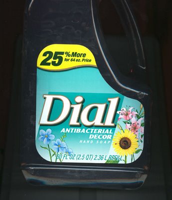
The picture above is from an 2.5qt. jug of Dial® hand soap.

Three things of note -

1. There's 25% more Dial® antibacterial goo in THIS jug than the 64oz jug, but the Dial® people aren't charging you for it. (Thanks!)

2. If you look at the bottom lower right hand corner, you can read that this jug is a refill container and not a dispenser. Good! Can you imagine how awkward this 4lb'er would be sitting next to the sink? Can't you see some little kid, teetering on a stepstool, trying to dispense their dollop of germ killer while balancing this behemoth? I can - then I hear the dull thud of 40lbs of flesh hitting the floor, the requisite 2 seconds of silence, then the rising crescendo of "wwwaaaaAAAAAHHHHH!!!"

So far, I'm flying wing to wing with the Dial® people, 100%.

3. The hand soap is "Antibacterial Decor" hand soap.

Gotta' tell ya, this "Antibacterial Decor" stuff stopped me dead in my kitchen. What on earth is "Antibacterial Decor"?

Our house isn't decorated in Antibacterial Decor. It's not ANY decor other than breakfast debris, stuff the 1yr old has pulled off/around and "kid friendly" furniture. And having just had the carpet vacuumed because our oldest puked Black Cherry Jello onto it, a case could be made that our flu-ridden house was decorated in VIRUS.

What would "Antibacterial Decor" look like, anyway? I can see a lot of white...a lot of enamel...a lot of chrome and stainless steel. Basically, a Dentist's office. There is no way I'm decorating my home like a dentist's office. But, I'm wrong about that anyway because the Dial® people have provided a clue as to what "Antibacterial Decor" looks like - it's floral. I guess when you think of "Antibacterial", think "flowers."

The marriage of floral and antibacterial stands to reason. It's hard to imagine those paragon's of clean - mothers - charging their children, "Stop playing with those filthy flowers!" or "As soon as you get done playing in those flowers, wash your hands. With soap!" Moms like flowers. Moms plant flowers. Moms covet flowers. Flowers = Spring and Spring = Spring Cleaning and Cleaning = destroying bacteria.

Interestingly, however, there's a bug on that sunflower - look closely at the 9 O'clock position. That little spot is actually an insect. It didn't come through on the scan, but I went out to the kitchen to have a close-up inspection of the container and indeed, it's a bug. And every mother knows that where there's bugs, there's bacteria.

And where there's bacteria, there's Dial® Antibacterial Decor soap to kill them.

Saturday, December 02, 2006

They're in Colton, I tell you...COLTON!


The above graphic is from a Foxnews banner ad. It's one of those clever internet ads that - in a nutshell - recognizes where the browser is from by doing a quick trace-route and then flashes customized, location-based content.

So, if I were in New York City, the ad above would read, "Find Wealthy Men & Beautiful Women In New York City."

Only, when I saw this banner ad, I happened to be in Sioux Falls, South Dakota. I didn't click on the banner ad to verify where it went, but it's probably safe to assume it's for a dating service. Makes sense - who wants to find "Poor Men & Ugly Women"?

Anyway, there are some interesting aspects to this little banner ad that are worthy of comment.

Colton is a typical prairie farm town and in typical prairie farm towns, being "Wealthy & Beautiful" is not like "Wealthy & Beautiful" in a city.

Oh, there's wealth in Colton. But it's Farm Wealth and "Farm Wealth" is different than "City Wealth."

Farm Wealth buys a $35,000 pickup every year and repairs clothes with duct tape. Farm Wealth spends $2,500 for cattle semen but won't buy milk without a coupon.

That guy in the photo? He's "City Wealth." If you're working around cows and corn without a shirt, you're not rich - you're messed up.

And there's beauty in Colton, too. It's Farm Beauty and "Farm Beauty" is different than "City Beauty."

Farm Beauty is a strong back, thick skin and dull sense of smell. Farm Beauty is looking good in whatever jacket the feed company is giving out - and if that family is a "John Deere Family," then Farm Beauty is GREEN.

That girl in the photo? She's "City Beauty." If she's working in Colton, it's by the hour and it's only during County Fair Week - and chances are, she won't be back. Ever.

Marketers are forever looking for silver-bullets - that word, that way, that, that...thing that will make people move on command. As the population grows, our privacy diminishes and technology becomes more invasive, ads like this will only get worse.

"Find 6 guys with new Ford F250s and 3 women who can run a round-bailer in Colton!"