Thursday, April 27, 2006

Wednesday, April 26, 2006

Brother, can you spare a quarter?


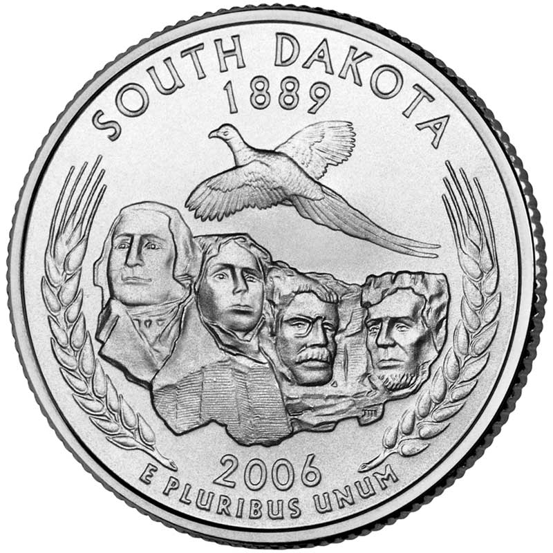
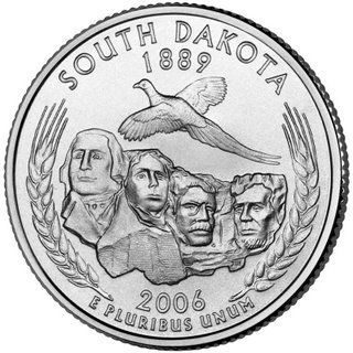
The above graphic is the design chosen for South Dakota's commemorative quarter.

The Commemorative Quarter program is extremely cool. It promotes interest in our currency, fertilizes state pride, enlivens history, gives something for coin collectors to get excited about.

However, a sadvertising reader made a commentary on the coin program's design-work as, "...poorly conceptualized and embarrassingly crude, almost childish in excecution." Strong words, but unfortunately, he's got a point or two.

Take the South Dakota coin above. Appreciating the challenges of reproducing figures in metal relief, I'm sure the artist could give Thomas a little more mouth definition. Right now, it looks like he's getting ready to blow puke down the hill.


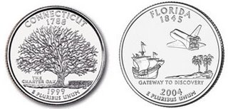
The Connecticut "Charter Oak" is rather stark - those who don't know the history of Connecticut's "Charter Oak", are left with only one assumption - the most notable thing about Connecticut is a dead tree.

Florida's coin is rather mysterious - old ship arrives, lands on the beach, then a spaceship leaves. Remember the movie Cocoon where all the old people get whisked off a retirement community by a UFO? According to the coin, Florida might well be a giant New Age space port for its burgeoning retirement community.


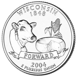
"Cows, cheese, corn - FORWARD!" I can hear those words rising up from schoolyard football games all across Wisconsin. Of course, Wisconsin's slogan is "Forward". But coupled with the graphics, all I can think of is, "Backward."

Oh well. The designers of these coins had to work with committees, focus groups and sacred cows of so many people - it's a testimony to the quality of the idea that even if the artwork is cheesy (WI), it's still cool.

Wednesday, April 19, 2006

Beaannnsssaaaahhhhhhrrrggghhhhh!!


The graphic above came from a 1952 Van Camps ad that we can assume was supposed to sell more Van Camps beans.

Instead, I think it's safe to say it scared the living hell out of its viewers and probably didn't sell many beans.

50+ years later, we can only hope the illustrator has found the peace, isolation and the heavy medication he/she needed because the person responsible for this art-direction nightmare was not quite right at the time.

Working from the bottom up, the product is well placed, but eating cold Pork and Beans out of the can ranks with scooping congealed bacon fat with saltine crackers as an all-time YUCK.

Not quite sure why it was necessary to include the drop of clear 'goo' dangling from the spoon - perhaps a competitor's pork and beans was perceived as dry? Anyway, we get the picture - these cold beans are glisteningly moist!

The shirt - has the texture and coloring of something that's been buried in the backyard. What's missing is "PROPERTY OF PSYCH WARD" stenciled on the chest.

Now, to the face. Ahh, the face of a little boy/girl/thing that only the Crypt Keeper could love. But, we know whomever spawned this gargoyle had a vain side - where else could little Damien/Damienita get support for wearing mascara?

Lastly, there's a story in that hat, but we probably don't want to know it. Maybe it was Grandma's hat. Maybe it was daddy's hat. Maybe it was...dunno. But I think we can be certain that the hat WAS someone elses at one time. But now, that hat is definately his/hers and we don't want to know how he/she got it.

"I told granny that I like my beans cold. Poor granny. She was not a good listener. It's not nice to be a bad listener. But because granny wouldn't listen, she had to give me her hat..." (cue psycho music).

I have no clue who to source for copyright, but then again, maybe it's better that way.